
Five charts to start your day
Will money continue to flow into money market funds en masse in 2024?


There has been a stampede into money market funds, a trend that began last year, especially during the US regional banking crisis. It's worth reflecting on and there were two excellent charts in the Financial Times. I've kept them together because it makes sense to do so. They complement each other.
Running a money market fund is all about scale. The fees on these products are extremely low, so a certain level of assets under management is needed for economic viability.
As you can see, in the US, there are just a few trillion-dollar AUM asset managers that dominate the market. What's interesting is how money market funds have grown in appeal recently and the yields on offer (as shown in the second chart) seem far more attractive than what you would get from traditional bank deposits.
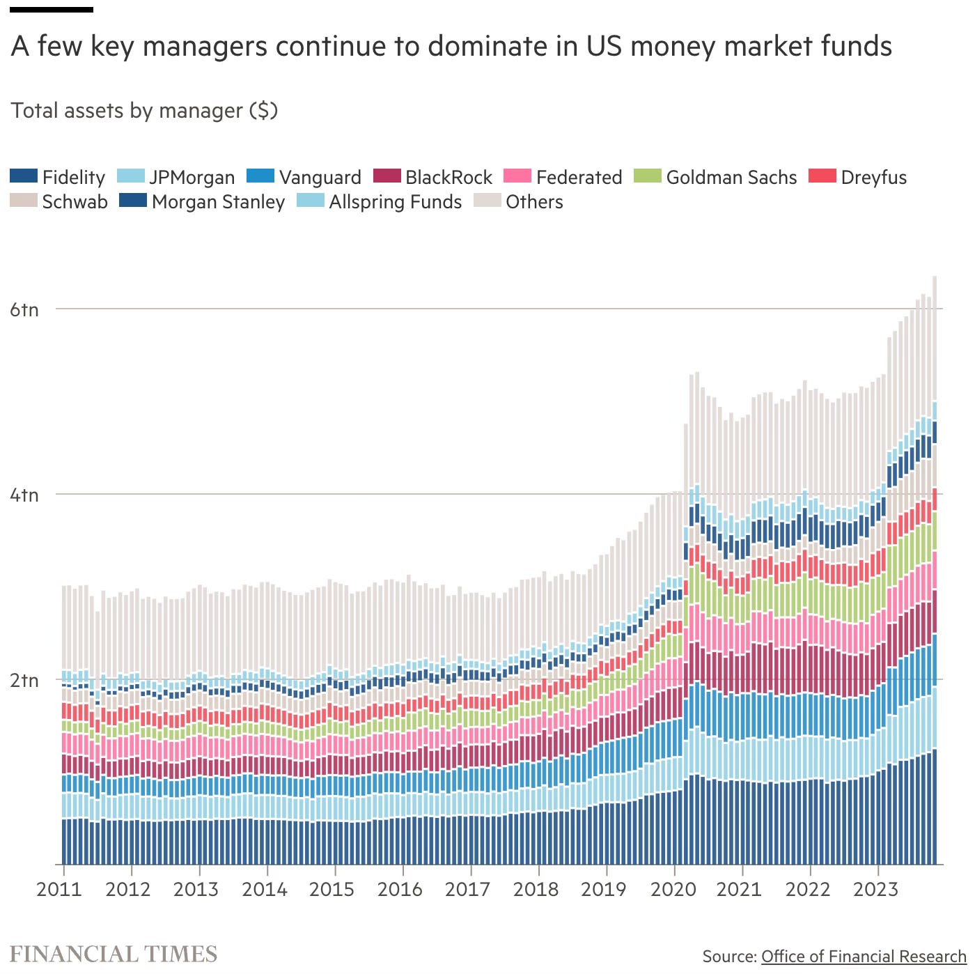
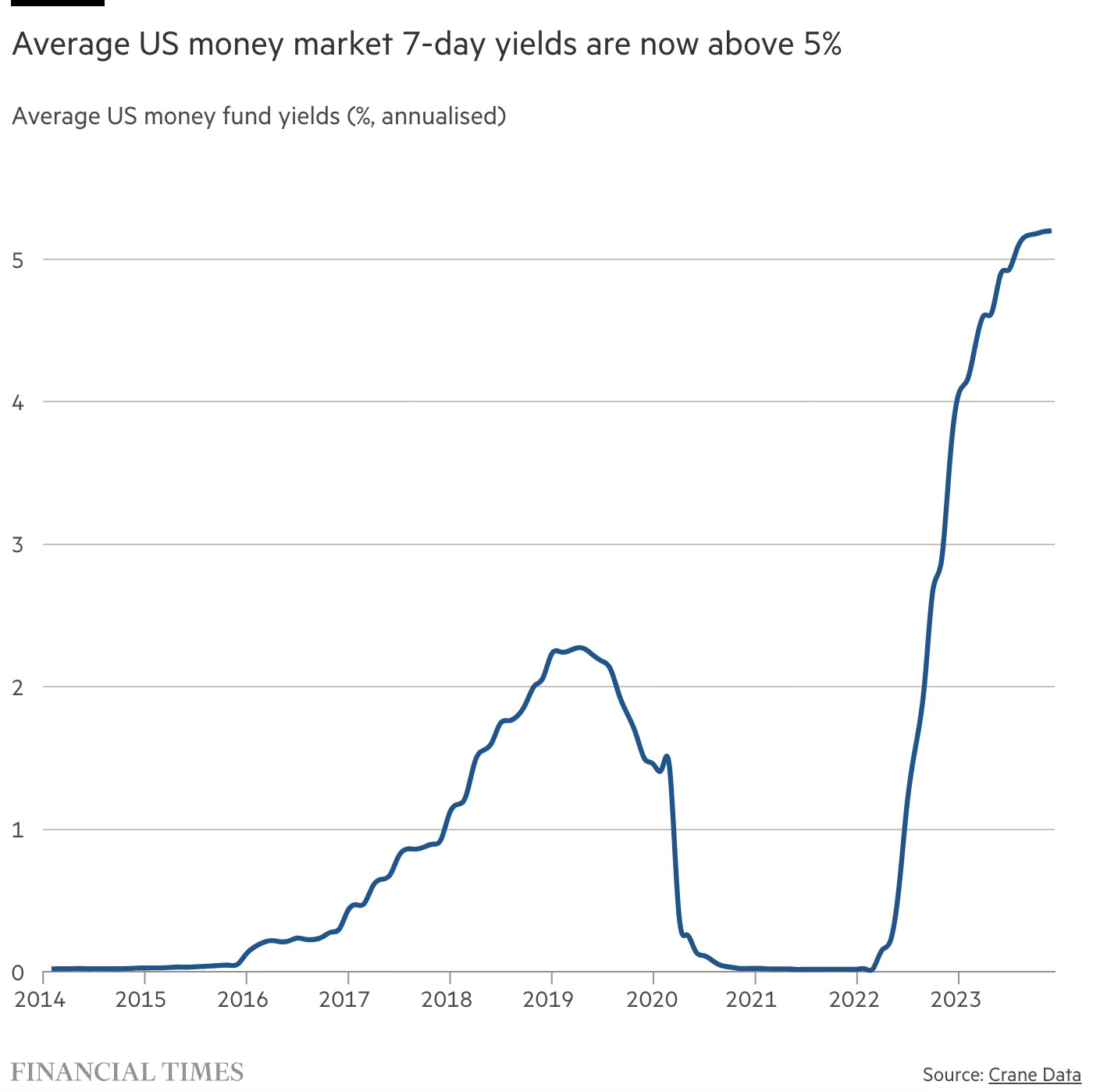
Source: Financial Times
Coming up:
Global stocks saw inflows of just $172 billion last year
What do the banks think about interest rate cuts in 2024?
The vast majority of ETF assets are in plain vanilla products
Junk debt beats high-grade three years in a row
If you like what you see here, and you would like to view the other four charts, consider becoming a paid subscriber. It costs less than two cups of coffee for a whole month’s access.
