
Five charts to start your day
The FTSE 100 is 40 years old

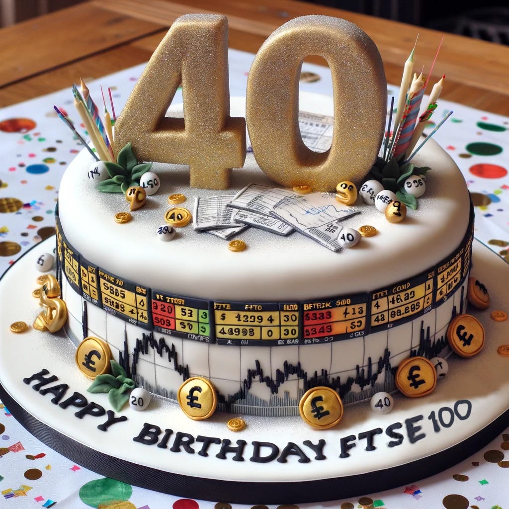
This is a massive trip down memory lane. Take a look at this first chart. It’s an animated bar chart race I created for Hargreaves Lansdown. This year, the FTSE 100 is forty years old, which is why they asked me to create it. We couldn't quite gather enough reliable data to take this chart back to its inception, but we did manage to go back to 1996.
Personally, I first started looking at this index back in 1997 when I was at school. My economics teacher, for fun, ran a fantasy stock portfolio competition. Bear in mind that at the time, the internet and World Wide Web were still in their infancy. The dot-com bubble was yet to properly inflate.
The most practical means for a school kid to get stock prices was to read them in the good old Financial Times. And that's what I did. I struck a deal with my local newsagent.
I could look at the stock prices in the Financial Times to see how well my portfolio was doing every morning and I didn't have to buy the paper. In return, I had to do a small paper round every Wednesday. It seemed like a pretty good deal at the time.
The FTSE 100: the 10 largest companies in the index
Coming up:
Luxury handbag prices are falling
Bitcoin’s story since the Pandemic
Rising shipping costs could stalls goods disinflation
London’s housing market has become inaccessible
If you like what you see here, and you would like to view the other four charts, consider becoming a paid subscriber. It costs less than two cups of coffee for a whole month’s access.
