
Five charts to start your day
Mirror, mirror, on the wall, whose the biggest company of them all

When I first saw Windows 95, it was on my grandfather's computer 29 years ago. That operating system completely transformed the way we used personal computers.
Of course, other technologies have since emerged, most notably the smartphone, which literally put a PC in your pocket. Smartphones have been so prolific that many people don't actually own a desktop or laptop PC.
So, take a look at this graphic from Visual Capitalist. You can see that Microsoft first rose to prominence in 1999. Then it competed with General Electric, before Exxon Mobil stole the spotlight in the mid-2000s.
But then everything changed in 2012. The iPhone arrived, which was basically the “PC in your pocket." First, it was Apple, then Microsoft, and then back to Apple who took the top spot. What this chart doesn't show you is that it is now back to Microsoft again.
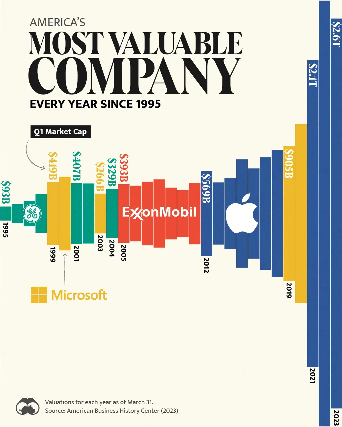
Source: Visual Capitalist
If you missed this last week by the way, this is a chart that I previously shared that fits this theme. It's worth watching again if you have time.
Coming up:
The S&P 500 does not fully reflect the real economy
US households have $18 trillion in cash
Microsoft and Apple combined are now larger than the Nikkei 225
Passive fund assets have overtaken active for the first time
If you like what you see here, and you would like to view the other four charts, consider becoming a paid subscriber. It costs less than two cups of coffee for a whole month’s access.
