Five charts to start your day
I look at hundreds of charts every day. And here are my top five that I saw yesterday
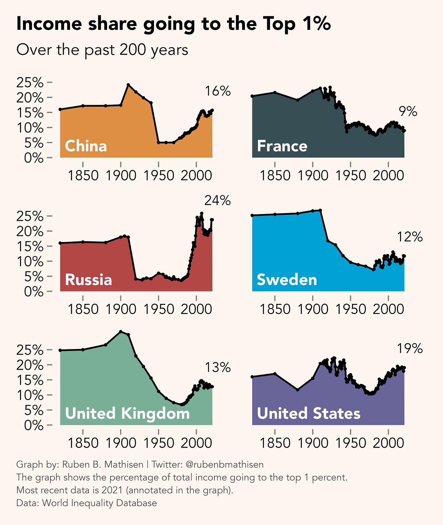
There is an interesting theme in the first (free to view) chart. Are the rich getting richer? This is something I’ve been thinking a lot about recently. In fact, I did a data visualisation on this topic last week.
What’s interesting is that many countries appear to be heading back towards that same era in the past, which was associated with huge disparities in wealth.
Ruben Mathisen’s snapshot in the first chart gives an incredible overview of this trend. Take a look!
Here is how the Top 1% have done across different countries over the past 200 years.
Source: Ruben B. Mathisen, Twitter @rubenmathisen (please follow), link to orginal tweet (please click and like):
https://twitter.com/rubenbmathisen/status/1675109516868820995?s=20
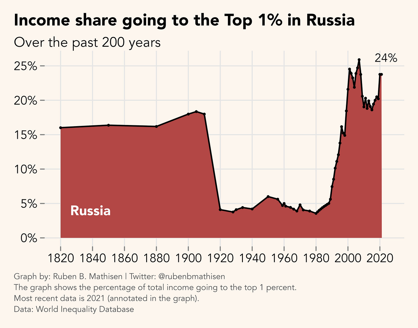
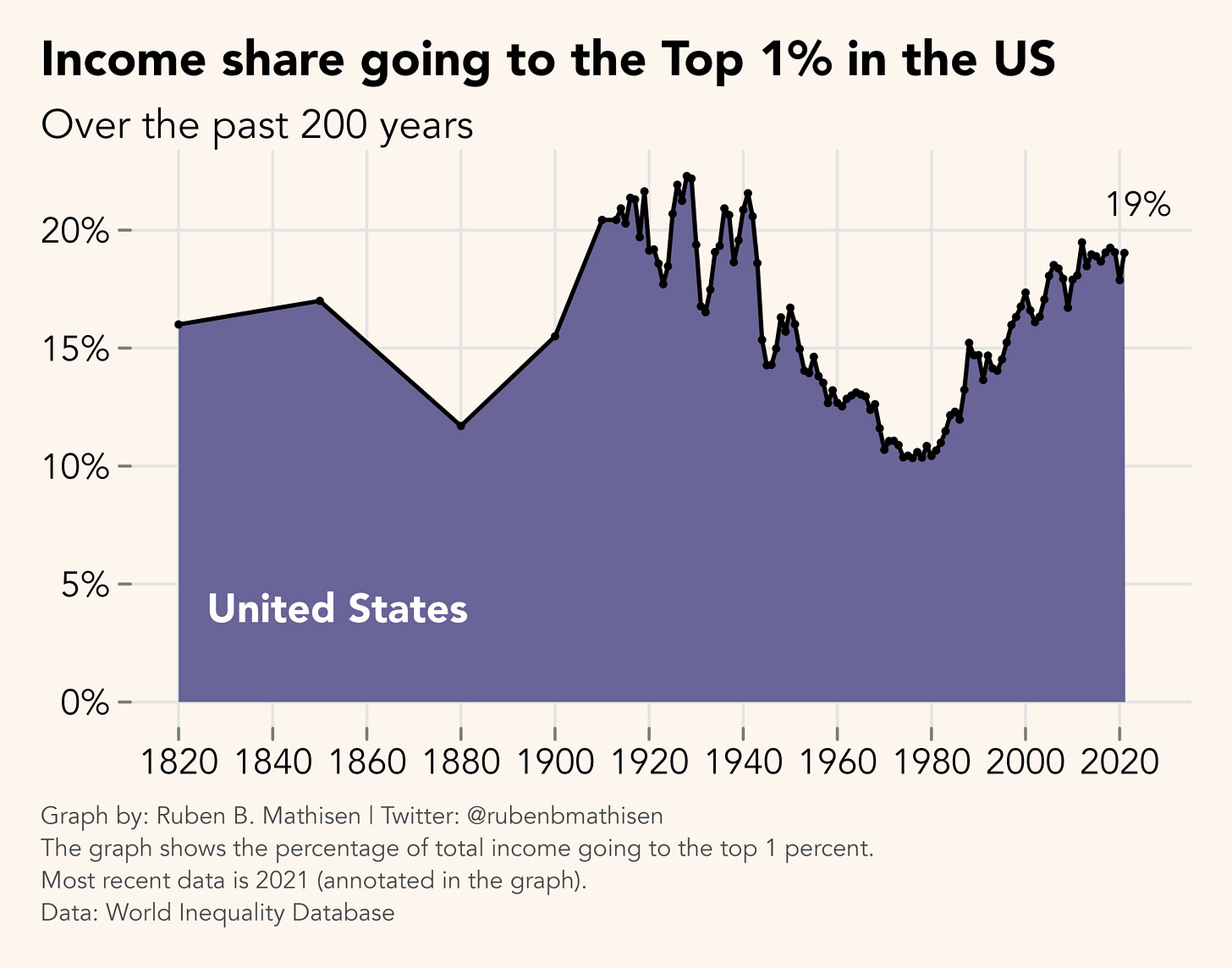
Ruben has also taken the liberty of blowing some of these charts up. I found the Russia and the US particularly interesting:
Russia
United States
If you are a paid subscriber, check out some the other charts I’ve been looking at. I promise you they are worth it.


