
Five charts to start your day
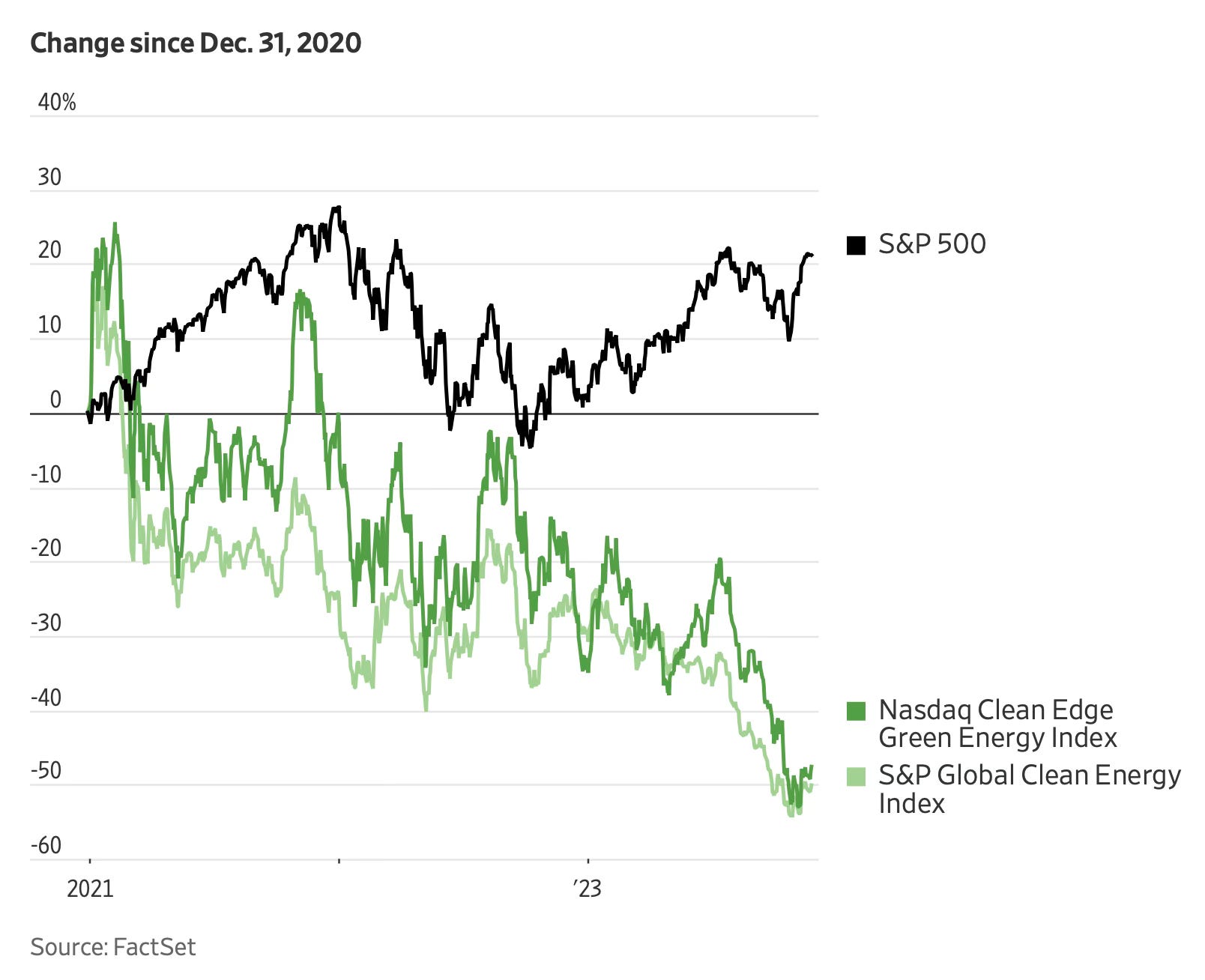
It seems the economics of transitioning to greener are quite poor

This is somewhat worrying. It seems the economics of transitioning to greener are quite poor. This doesn't mean the transition has halted, but it does suggest that a greater effort is necessary to succeed. The cost of this transition must be covered, and neither shareholders nor consumers are willing to bear the brunt of it.
This is reflected in the chart: both the Nasdaq Clean Edge Green Energy Index and the S&P Global Clean Energy Index have plummeted, nearly halving in value compared to the S&P 500 since early 2021.
Despite the significant investments in clean energy, a lot was made pre-pandemic, at a time when low interest rates made renewable energy projects financially attractive and federal budget deficits were less of a threat to private investment.
The S&P Global Clean Energy Index has fallen 30% this year
Source: The Wall Street Journal
Coming up:
A brief history of interest rate, cuts and recessions
Chinese investment into semiconductor manufacturing is a geopolitical manoeuvre
Decomposing US inflation to find the main drivers
Ukraine’s top 10 donors
If you like what you see here, and you would like to view the other four charts, consider subscribing. It costs less than two cups of coffee per month.
