
Five charts to start your day
Quantifying the brutality of conflict

It’s hard not to think about war at this moment in time. Wars are unpredictable and scary. The first chart of today, or data visualisation, is a historic and empirical study of war going back 600 years. It was produced by Max Roser and published by “Our World in Data”.
Global deaths in conflicts since the year 1400
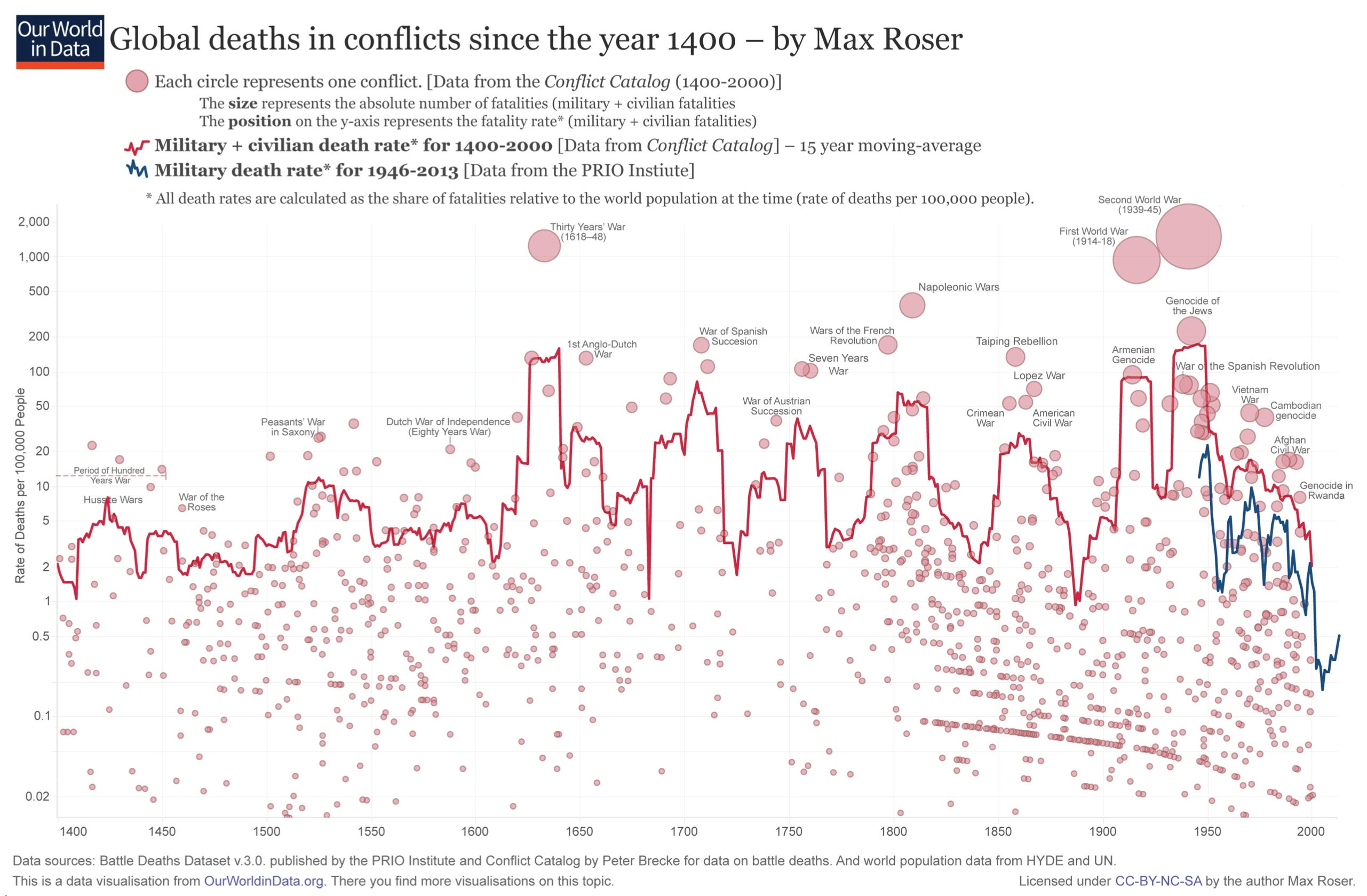
Source: Max Roser
As you can see the frequency of wars has increased over the centuries. Furthermore, they appear to have increased in severity – the worst being the First and Second World Wars.
On the one hand perhaps the increase in lethality of war has been created by the mechanisation and industrial scale of wars in recent times. But on the other hand the world is also a lot more populated than before, creating the right environment for larger conflicts.
Coming up:
The US economy’s secret weapon are seniors with money to spend
Interest payments form an increasingly large part of the US budget deficit
The percentage of US public debt held by Japan and China is on the decline
Minecraft has outsold Tetris
If you are a paid subscriber read on. If not, consider subscribing. It costs less than two cups of coffee for a whole month of access. Subscribe now and receive five times more chart every morning in your inbox.
