
Five charts to start your day
Air pollution in our capital cities

I’m seriously impressed with this data visualisation from Visual Capitalist. To some one like me, the term “PM2.5 concentrations” doesn’t mean a lot. But when you visualise it like this, it makes a lot of sense.
Instead of lots of numbers, it uses the density and shade of the dots to show how bad the air quality has become in each city. The more dots and the darker they are, the worse air.
Why is this important? The kind of pollution they're showing, called PM2.5, are really tiny particles in the air that can hurt our lungs. By showing how cities compare, we can see where the air is dirtiest and most dangerous.
Air pollution in 50 capital cities around the world
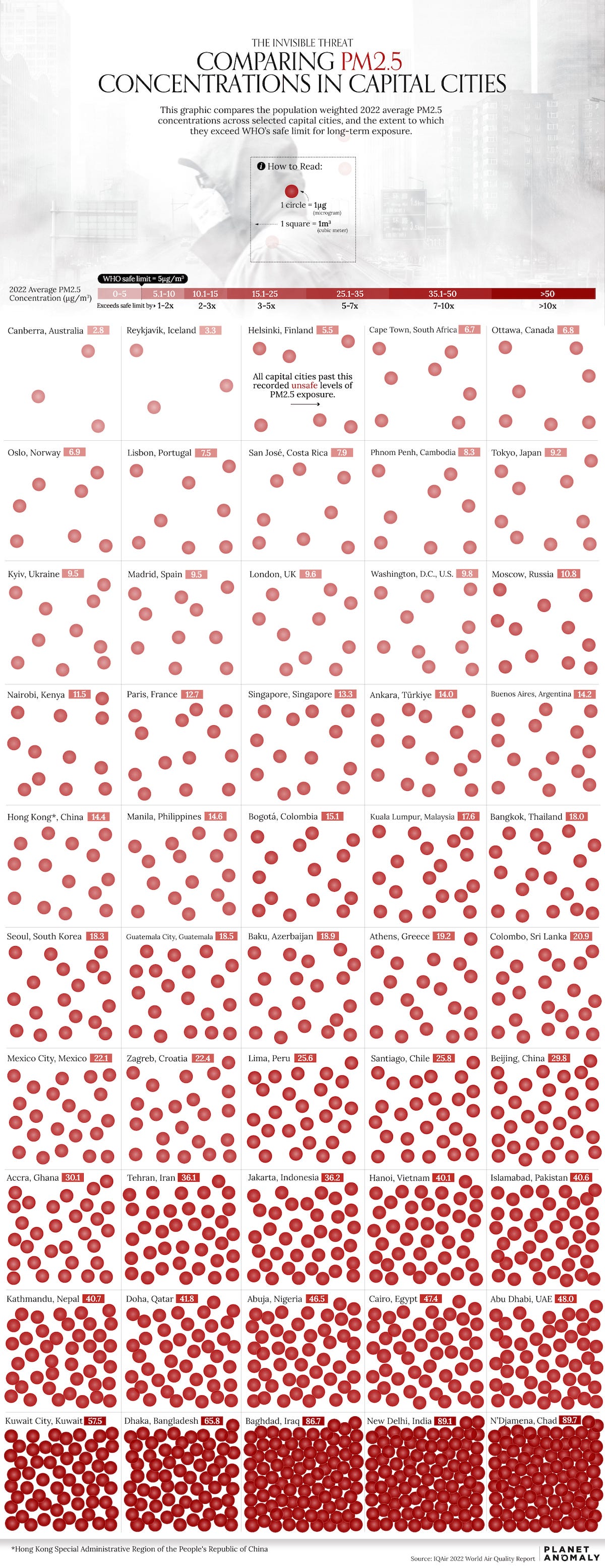
Source: Visual Capitalist
I’m surprised how well London ranks. Although not brilliant, it’s still not as bad as I initially thought. I grew up there, so its performance matters a lot to me.
It has become especially important now because the city has an Ultra Low Emission Zone for vehicles. If your car doesn’t meet the right standards, you have to pay £12.50 a day to drive your car in the zone. Ouch!!
Coming up:
September 2023 was by far the hottest in recorded history
Alphabet’s most recent income statement broken down
These are the critical minerals needed for clean energy technology
Nuclear has stalled in the US
If you would like to view these charts, why not become a paid subscriber? You would be actively supporting me and the work I do. You can even take out a free one-week trial.
