
Five charts to start your day
Monkeys, dartboards and equity income portfolio managers


We love to bash the old active portfolio manager. Darts being thrown by a monkey at The Wall Street Journal and all that. And during 15 years of ultra low interest rates before the end of the pandemic, investors bought this story. Trillions flowed into the ETF industry.
Another area that attracted huge inflows was equity income. In that low yield environment, investment grade bonds and US Treasuries weren’t that appealing as a source of income.
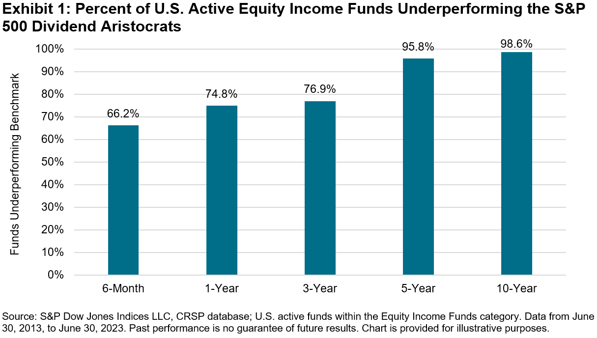
So that is the context for today’s first chart: active equity income portfolio managers underperformed the index over the past decade. You can imagine my surprise then when I saw this chart over the weekend. It’s quite unbelivable.
Most active equity income managers fail to outsmart the S&P 500 Dividend Aristocrats Index
Source: S&P Dow Jones Indices
This chart is based on the S&P’s now famous Dividend Aristocrats index. To be eligible for inclusion, companies must be a member of the S&P 500 and have raised dividends for a minimum of 25 consecutive years. Yikes!
Well, there are enough companies out there for the S&P to make an index – 67 to be precise. And this chart is from a blog written by Rupert Watts at S&P.
According to Rupert: “The funds used in our analysis are sourced from the CRSP database within the Equity Income Funds category. The analysis was conducted using the same methodology and underlying analytical engine used to produce S&P DJI’s semiannual SPIVA® U.S. Scorecards”.
Now, I don’t know exactly how accurate the methodology is, but this is a truly terrifying chart to behold. The equity income industry is huge and diverse. There are many different strategies out there, including those that offer enhanced derivative overlays to boost the yield.
All I can say is wow!
Coming up:
2. Consumer staples have been the worst performing sector over the past five months
3 and 4. Pessimistic Americans are driving from the same old homes to the same old jobs in the same old cars
5. Being an American auto worker doesn’t pay like it use to
Now you won’t see these other five charts unless you are a paid subscriber. I can’t give them away for free. I have to earn a living. So please support me and consider being a paid subscribing. It costs very little.
