
Five charts to start your day
Do active portfolio managers deliver returns we desire?


January is an interesting month in the calendar. It is the month where we make New Year resolutions for the year. And it's also the month where we try to better ourselves whether it is going to the gym to burn off some calories or to try and get our finances in order.
We tend to focus a lot more on the quality of our investments and how well they are doing. One area focuses whether or not active managers are actually delivering the returns we expect from them for the fees we pay.
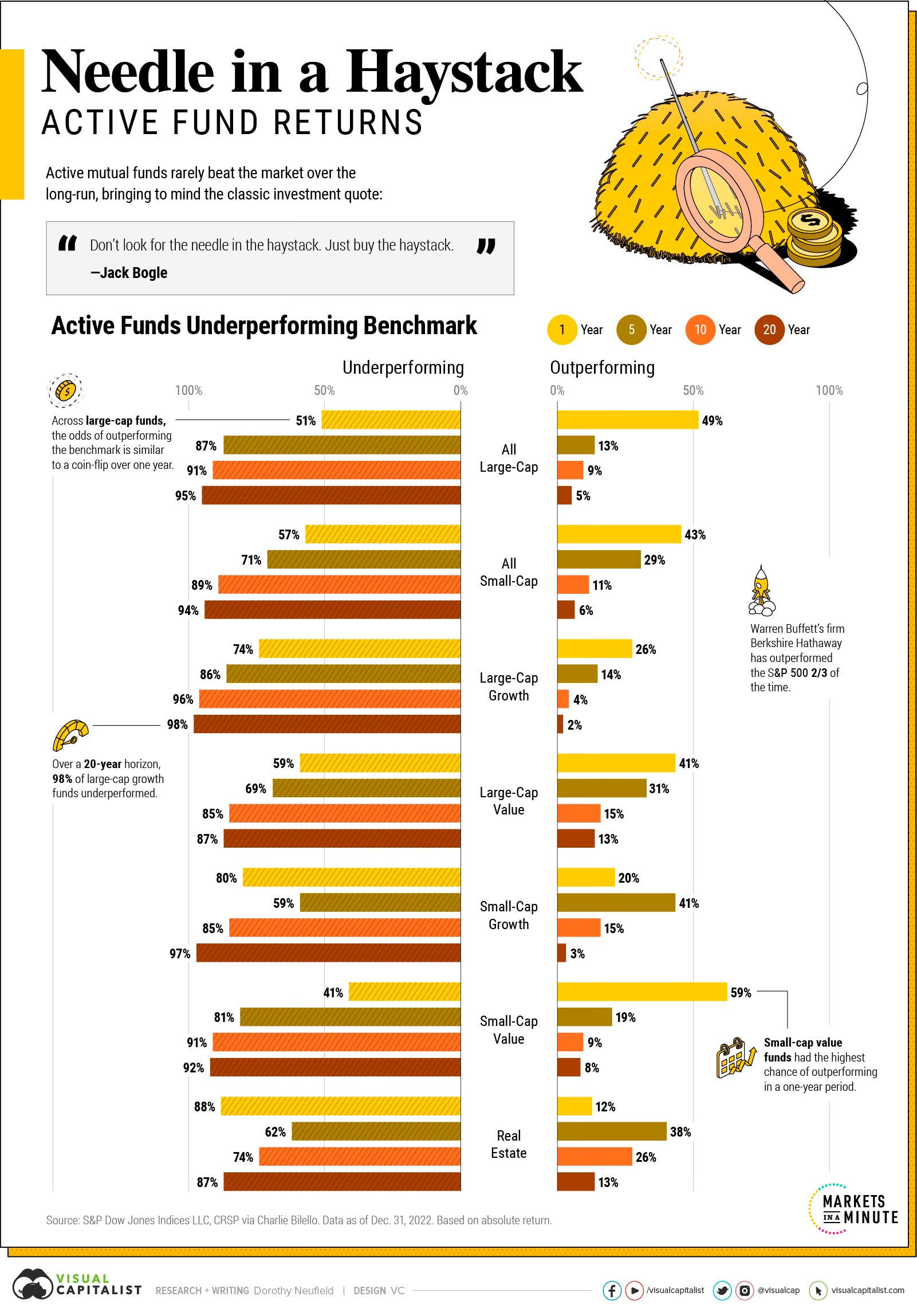
That's why I thought this was a really interesting data visualisation by Visual Capitalist. Long run outperformance by active funds is apparently like finding a needle in a haystack.
If we just focus on large cap funds, the odds of outperforming is like flipping a coin. However, once you start adding on the years, these odds become a lot worse. Over a 20-year period the chances of outperforming are just 5%.
Source: Visual Capitalist
Coming up:
America’s top new year resolutions for 2024
How will the "Magnificent Seven" perform in 2024?
Global stock markets record best year since 2019
How have certain stocks performed over the last 10 years
If you like what you see here, and you would like to view the other four charts, consider becoming a paid subscriber. It costs less than two cups of coffee for a whole month’s access.
