
Five charts to start your day
How the market priced in the return of CEO Sam Altman to OpenAI


Risk is an important concept when investing. How it is priced in also matters. That's what this first chart is about. It is an amazing data visualisation created by Blake Law.
It’s based on data from Manifold Markets, which is a play-money prediction market platform where users can bet on various future events.
The story here centres on Sam Altman and the fiasco that occurred at OpenAI in November. What’s interesting is how the flow of information after his dismissal affected the probability of his return. It was an intraday event. Every time new information was released, it impacted the likelihood of whether he would return. It was a highly emotional response to a fast-moving situation, similar to how financial markets respond during a crisis.
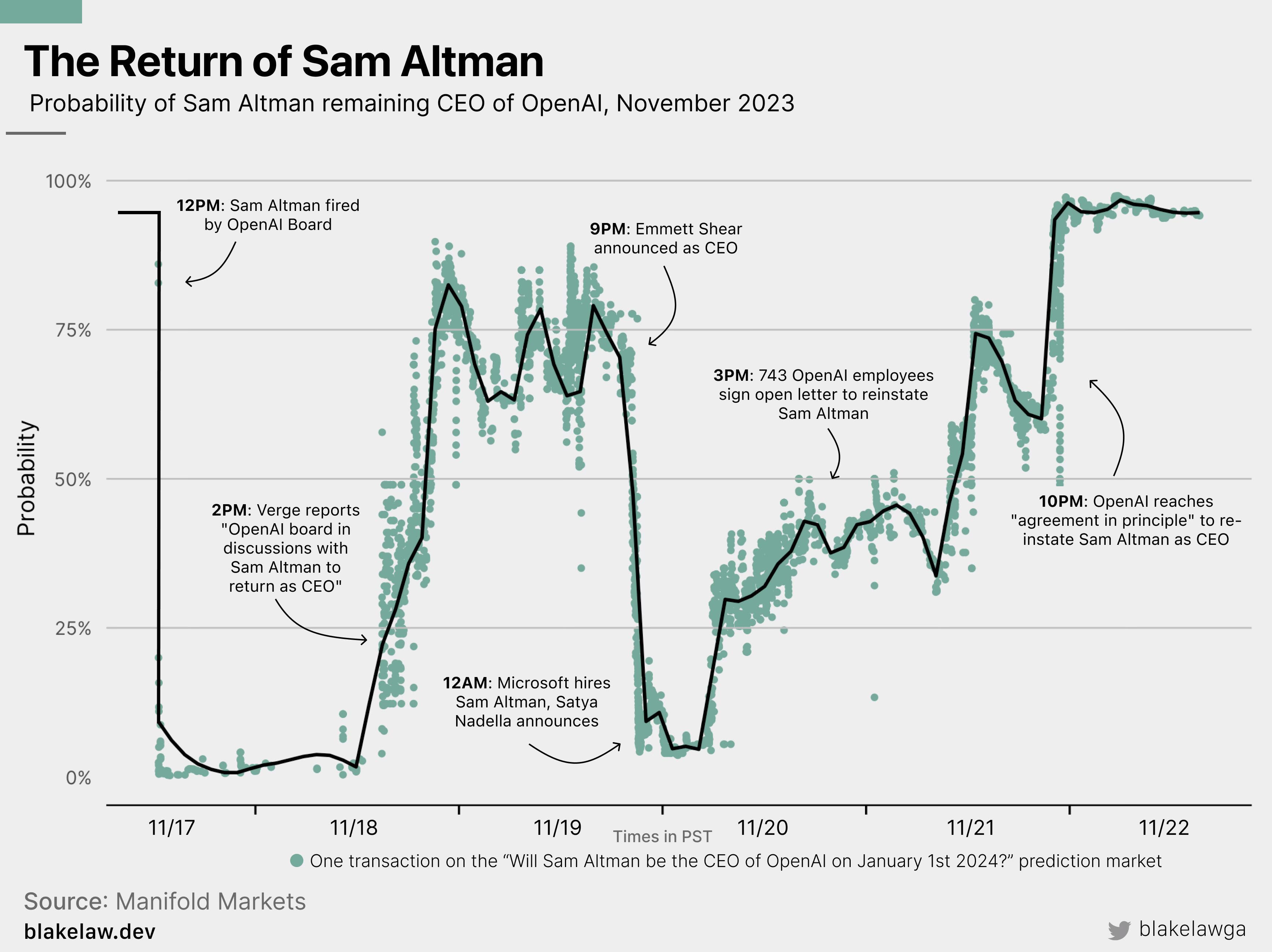
Source: Blake Law
Coming up:
Who holds America’s debt?
France appears to be a dangerous place to work
Investors have fallen out of love with China
Every asset class was up in November except oil
If you like what you see here, and you would like to view the other four charts, consider becoming a paid subscriber. It costs less than two cups of coffee for a whole month’s access.
