Five charts to start your day
Women participation in the labour market reveals an interesting tale
Data often defies conventional wisdom. It reveals our human biases and assumptions. It challenges the stories we listen to and accept as fact. This is what I love about today’s first chart.
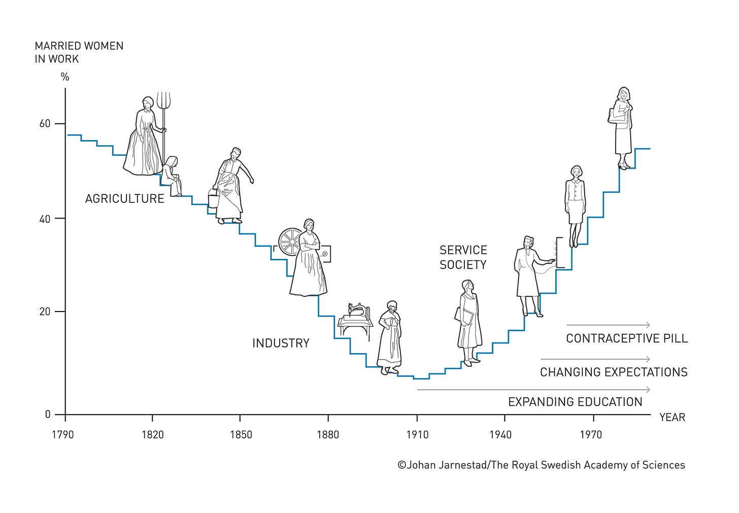
Female participation in the labour market over the last 200 years
Source: The Nobel Prize
This year’s economic sciences Nobel laureate Claudia Goldin shows that female participation in the labour market was not an upward trend. Instead, it evolved as a U-shaped curve over 200 years.
The participation of married women decreased with the transition from an agrarian to an industrial society in the early nineteenth century. It then started to increase with the growth of the service sector in the early twentieth century.
Claudia explained this pattern as the result of structural change and evolving social norms regarding women’s responsibilities for home and family.
Coming up:
Real GDP and per capita income are higher in the West Bank than Gaza
Top countries for foreign direct investment
Personal interest payments are surging in the US
Bonds are becoming more volatile than stocks
Now if you want to see the next four chart mentioned above, why not become a paid subscriber and directly support my work. It doesn’t cost much and you can opt for a free trial to get you started.


