
Five charts to start your day
Tech has absolutely dominated the S&P 500 this year and has delivered most of the index' performance

Tech has absolutely dominated the S&P 500 this year. Just take a look at this data visualisation that I published yesterday. Now I've covered this before, but I've never actually broken down the return contribution into its component parts i.e. the Magnificent Seven: Apple, Microsoft, Amazon, Alphabet (Google), Meta, Nvidia and Tesla.
In some instances during this year, the rest of the S&P 500 (colloquially called, the S&P 493) actually took away performance from the Index. Watch the video and spot those moments when that occurred. It really makes you wonder, what does the S&P 500 mean anymore? Should it just be called the S&P 7?
If you don't fancy watching the video, here is the static version at the end.
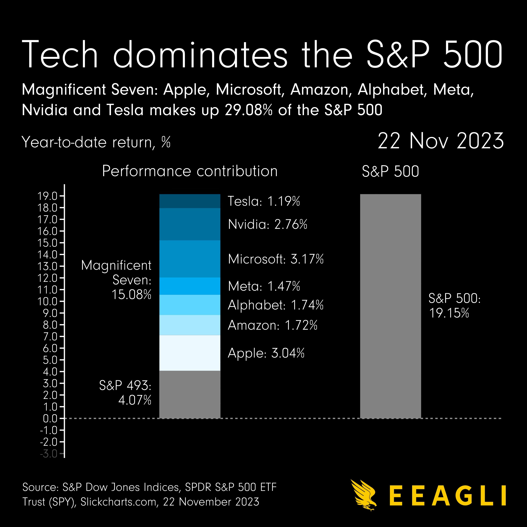
It's pretty mad isn't it? Without those seven magnificent, mega technology firms, we as investors would've only earned 4.07% from the S&P 500 this year. Bear in mind inflation is 3.2% in the United States year-on-year.
Coming up:
It no longer makes sense to buy a home in the US
The dollar has slipped to three-month low as investors bet rate cuts
America’s love of trucks has only grown in recent years
US gross domestic product broken down by industry
If you like what you see here, and you would like to view the other four charts, consider subscribing. It costs less than two cups of coffee per month.
