
Five charts to start your day
Is it back to normal at last for stocks and bonds?


Returns on stocks and bonds are diverging! Well, it’s about time too. This is precisely what they are supposed to do. These returns are meant to exhibit a negative correlation to each other. You know, go in opposite directions, so you can get the full benefits of diversification.
I came across a chart today in the FT, so you can imagine my (geeky) excitement with this development and decided to run the numbers myself. When I first entered the investment management industry, I was always told, “don’t put all your eggs in one basket and diversify your portfolio into multiple asset classes.”
However, ever since the Financial Crisis 16 years ago that conventional wisdom has been wrong. Everything seemed to float upward, even the less favourable assets. We endured a period of prioritising growth-at-any-cost and opted to save on fees with tracker funds, leading to the demise of active management. Cash became trash, and quality seemed too dull to consider.
This divergence is undoubtedly a relief for 60/40 portfolios, a strategy I am not particularly fond of. Nonetheless, these portfolios represent substantial portions of US pension money so it's significant. At last, after all these years, they actually might work at delivering some kind of diversification.
If this return to the norm in bond and equity investing persists, it will also bring significant relief for many investors. The FT predicts that this divergence will continue. Higher interest rates have made bonds less appealing in the short term. Conversely, substantial fiscal spending (the Inflation Reduction Act), a robust job market and strong US consumption have bolstered stocks.
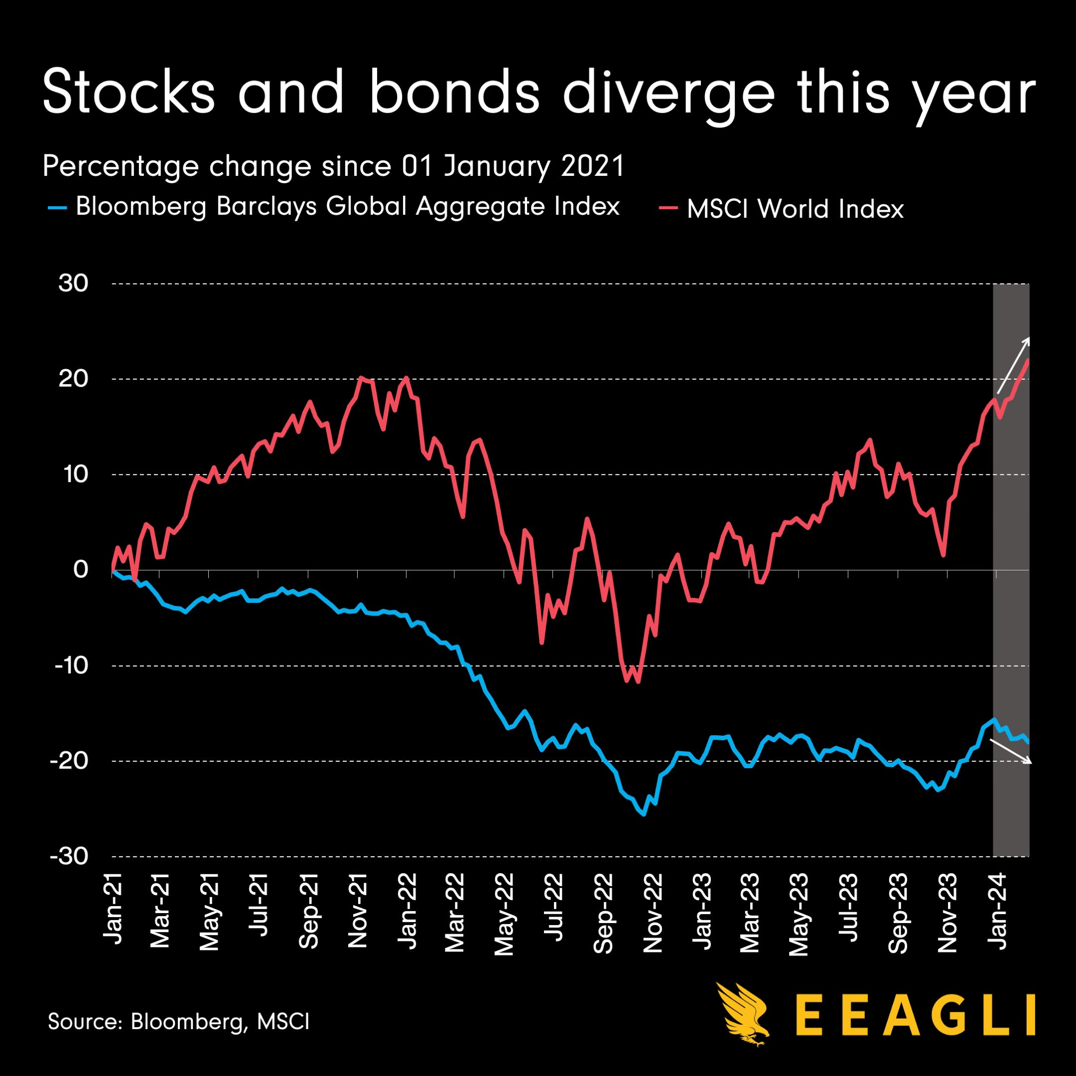
Source: Financial Times
Coming up:
Europeans keep far more of their wealth in cash than Americans
The US sanctions against tankers carrying Russian oil appear to be working
The US trade deficit reached $773 billion in 2023
Fifty years of global stock markets
If you like what you see here, and you would like to view the other four charts, consider becoming a paid subscriber. It costs less than two cups of coffee for a whole month’s access.
