
Five charts to start your day
Swiss Big Macs are really expensive

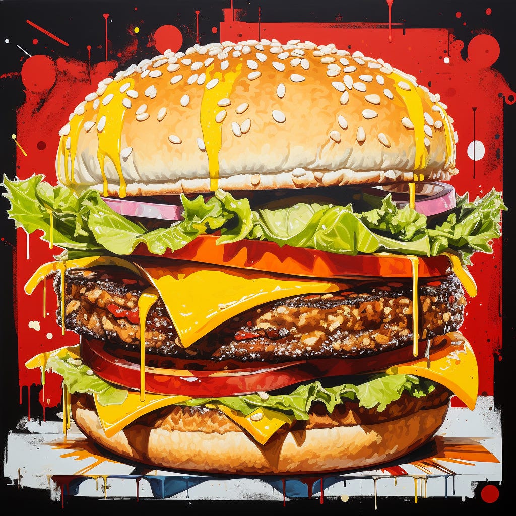
Once every six months, the Economist updates the Big Mac Index. This is a semi-humorous illustration of the famous economic theory of purchasing power parity (PPP). They have been doing it since 1986.
Basically, it's a light-hearted way to measure something called the purchasing power parity (PPP) between countries.
Purchasing power parity is an economic theory that over the long term – in the absence of transaction costs and official barriers to trade – identical goods will have the same price when expressed in a common currency. In this case, the identical good is a Big Mac and the common currency is the US dollar.
Here's how it works. By comparing the price of a Big Mac in various countries, converted into US dollars, you get an idea if a currency is under or overvalued versus the US dollar.
Of course, this is a very crude measure and shouldn’t be taken too seriously. Currency markets are complex and there are multiple factors that determine an exchange rate. But it is interesting nonetheless.
Take a look at this data visualisation that I’ve created.
Switzerland has the most expensive Big Mac in the world
It’s probably not the best way to visualise this story, but it is fun.
If you want to see some of the other charts I’ve been looking at, why not become a paid subscriber. It costs less that two coffees for a whole month of access.
Coming up:
More sausage rolls for the Brits
The 10-year treasury yield is the highest since Oct 2007
The US labour participation rate hasn’t fully recovered from the Pandemic
UK shop price inflation is on the decline
