


If you are in the UK, the first chart will interest you. If you are not, it is still interesting. It’s a rinse and repeat story.
For many homeowners, buy-to-let landlords and first-time buyers, this is a chart that might provide some relief. I also love how Bloomberg have kicked it off with a label referencing Liz Truss’ disastrous stint as Prime Minister last year. It’s slightly political, but appropriate.
Mortgage costs in the UK are gradually falling
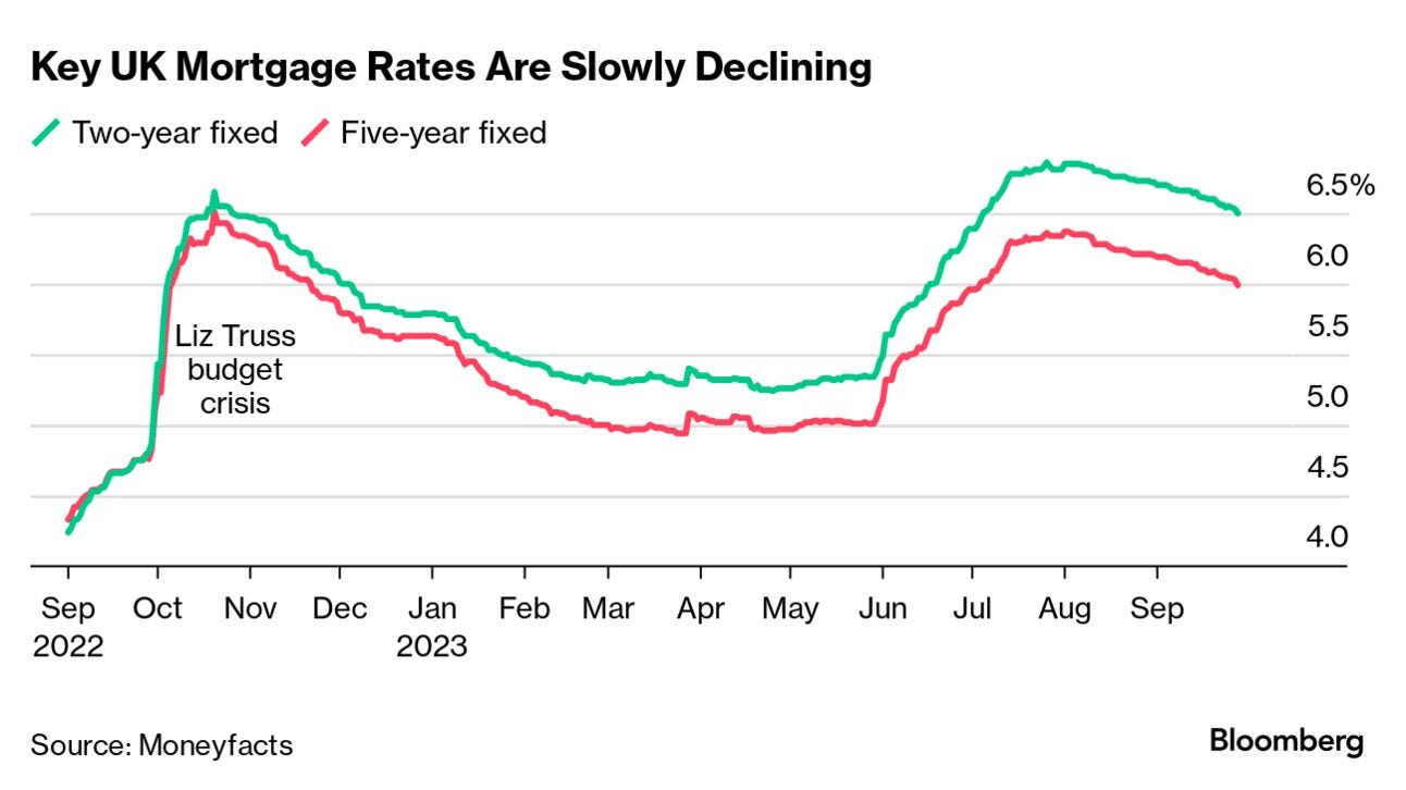
Source: Bloomberg News
Ironically, I actually locked myself into a sub-four-percent mortgage in September 2022 – lucky me. But make no mistake, rising interest rates have had a profound impact on the property market. This includes my rented-out apartment in central London.
Buy-to-let landlords are starting to sell up as the cost of their buy-to-let mortgages rise, flooding the real estate market and causing prices to fall. But, this has led to a fall in rental property supply as well, which has seen rents shoot through the roof. The result? A surge in rental yields from the twin effects of falling house prices and rising rents. I’m not sure whether to be delighted or worried.
Furthermore, this seems to be a pattern repeating itself in other major cities around the world.
Coming up:
White Britons die at a higher rate than all other ethnic groups
Inflation slows in Germany
How long does it take to double your money?
The mega techs leave the rest of the S&P 500 behind
If you want to view these other charts, you are going to have to become a paid subscriber. If you already are, read on…
