
Five charts to start your day
Coal, Gas and Public Transport

None of this should be too surprising. We all know that our global economy runs on fossil fuels. We also know that air quality in our cities is getting worse and that temperatures around the world are rising. But when you visualise data behind these stories, it becomes a lot clearer and easier to understand.
Coming up:
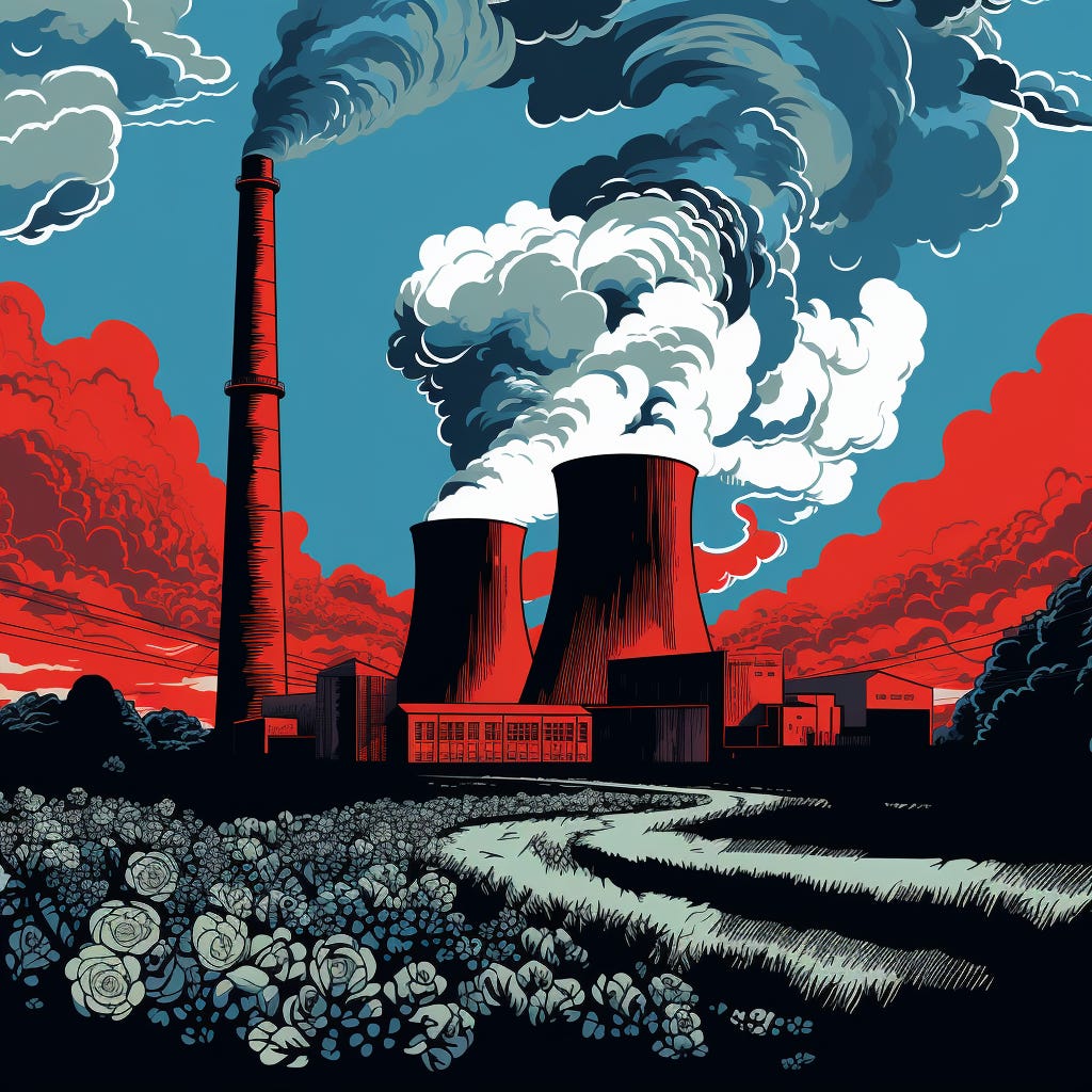
Coal remains the largest source of electricity generation globally
The poorest Americans are rapidly using up all their savings
Which country uses public transport the most?
The US is pulling ahead when it comes to LNG exports
As we get older we tend to choose the job we love over money
The first chart is free. If you would like to view the rest, consider becoming a paid subscriber. You will get access to all the charts that caught my attention the day before. It costs less than two cups of coffee for a whole month of access.
Coal remains the largest source of electricity generation globally

Source: Visual Capitalist, https://elements.visualcapitalist.com/what-electricity-sources-power-the-world/
So coal is still king. It still leads the charge when it comes to electricity, representing 35.4% of global power generation in 2022, followed by natural gas at 22.7%, and hydroelectricity at 14.9%.
Over 75% of the global coal-fueled electricity is used in merely three countries. China is the largest coal consumer, accounting for 53.3% of the worldwide coal demand, followed by India at 13.6%, and the US at 8.9%.
The combustion of coal, for electricity as well as metallurgy and cement manufacturing, is the primary source of global CO2 emissions. Despite this, coal usage in electricity generation has surged by 91.2% since 1997, the year the inaugural global climate accord was inked in Kyoto, Japan.
