
Five charts to start your day
Bond yields are rising!!


Rising long-term yields! This is the story of the week. So what’s behind the rise in yields at the long-end of the yield curve? The answer is real yields, which have soared to levels not seen since the Financial Crisis 15 years ago.
Yesterday I released a data visualisation mapping the paths of the yield curve over this period. If you missed it, head over to my YouTube channel and watch here (and don’t forget to like and subscribe).
So why are real yields rising?
In short, it is because long-term inflation expectations have risen. The market sees higher than two percent inflation persisting in the US over the long term. Interest rates are therefore likely to remain higher for longer. Just a few hours ago while I was writing this, Bloomberg published this chart:
Long term real yields have soared
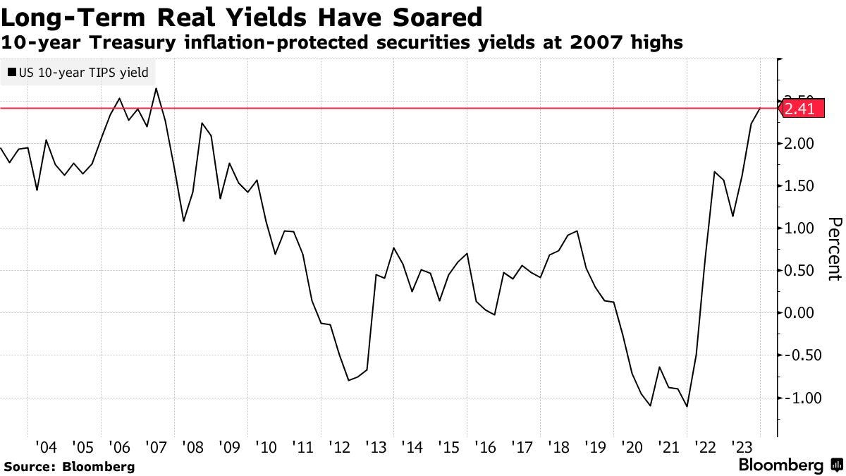
Source: Bloomberg
If I have time later today, I will construct the long-term real yield curve for all to see. I think it’s worth a look.
In the meantime this is what’s coming up:
The cost of breakfast in the UK keeps on rising
Global temperature data for September was “gobsmackingly bananas”
Fiat currency dollar up, gold down
Bank credit is officially contracting
If you're a paid subscriber, read on to enjoy. If not, subscribe and take a look. It costs less than two cups of coffee.
