
Five charts to start your day
Oil prices surge… again…


So Hamas have attacked Israel is a daring raid. Was this bound to happen eventually? Yes! It’s a classic example of a known risk that was underestimated. And with that the level of risk aversion in global markets has risen even if the linkages don’t seem that apparent.
A rally in the oil price to $88 per barrel this morning seems the most obvious linkage. But, then again may be not. Oil isn’t really produced by Israel and this latest conflict is unlikely to dent the secretive warm relations Israel has with certain gulf Arab countries (even if those relations are not officially recognised).
Oil prices surge… again…
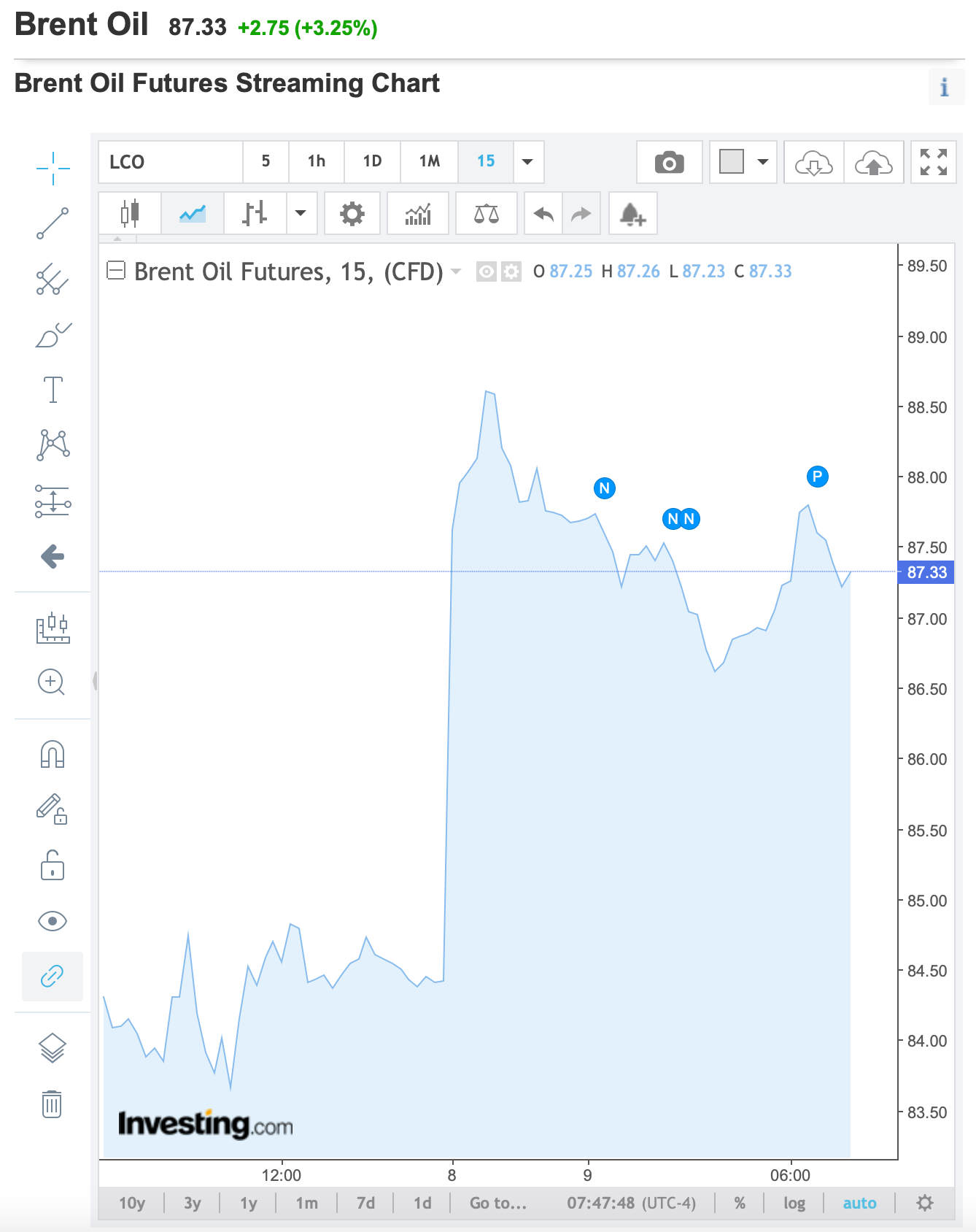
Source: Investing.com
Ok, so the linkages are loose. But at this point is time Mr Market is looking for any excuse to panic. This is not about causality and fundamentals. This is fear. It may peter out in the coming days. But for now, that big jump in the chart above is what happened this morning after a weekend of conflict.
Coming up:
The gap between the US dollar and euro widened when it comes to international payments
China’s total debt-to-GDP ratio rivals the US
When do people really retire?
US housing is less affordable than ever
If you want to view these charts, become a paid subscriber. I look at hundreds of charts a day as part of my job, and these are my top picks. It costs less that two cups of coffee for a whole month’s access. So consider it!
