
Five charts to start your day
How surging yields brought the stock rally to a halt


Check out the link to the first chart. It is actually part of a series of eight charts from a Wall Street Journal article called “How Surging Yields Brought the Stock Rally to a Halt”.
This chart fits this story well. What you see is the decline of the equity risk premium that equity investors once enjoyed. This is largely due to surging bonds that have risen in response the the US Federal Reserve's interest rate tightening cycle.
The equity risk premium in the US continues to narrow
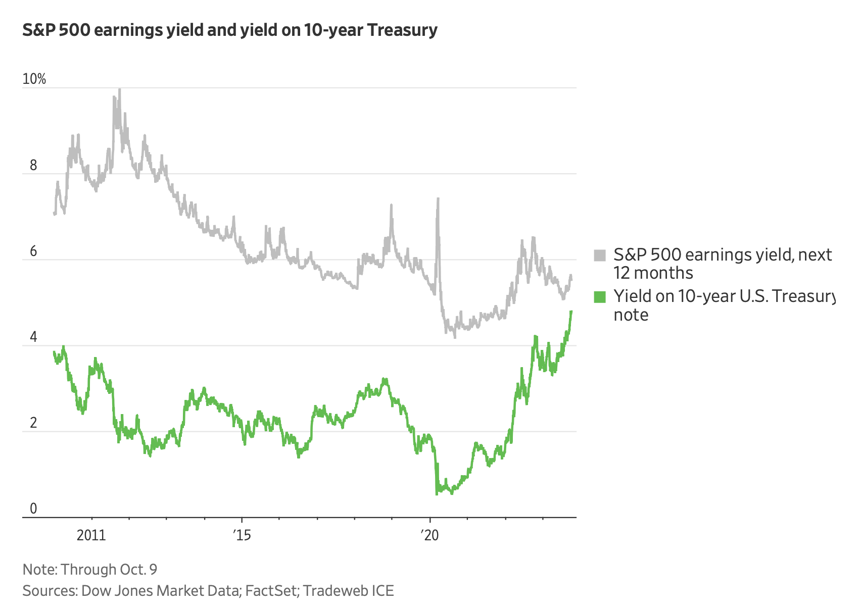
Source: The Wall Street Journal
This is quite an interesting development. It shows that the upside to holding equities has shrunk considerably.
Coming up:
Europe’s natural gas market is on edge before the winter starts
What are retail investors focusing on right now?
M2 money supply has contracted significantly
R&D spending from the 10 largest companies on Nasdaq
If you are a paid subscriber, read on. If not, consider subscribing. It costs less than two cups of coffee for a whole month of access. Subscribe now and receive five times more charts every morning in your inbox.
