
Five charts to start your day
The market is reigning in its expectations of Fed rate cuts


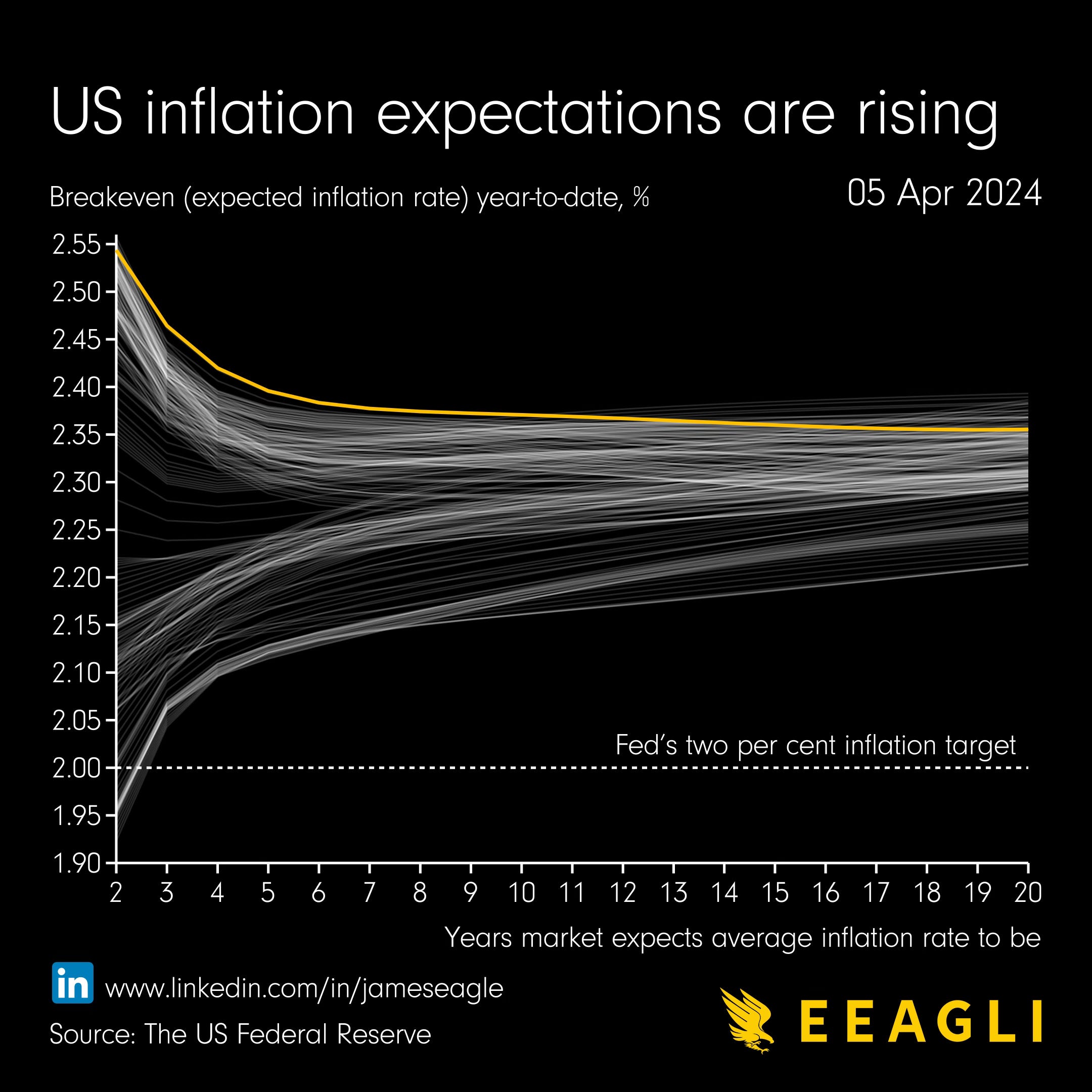
Inflation seems too hot for a Fed rate cut when you look at recent inflation reports. Even the Fed has appeared a bit hawkish recently. So take a look at this chart. It shows what the market thinks.
Since the start of the year the market has been dampening its rate cut expectations. And you really see this when you look at the breakeven curve.
A what? A breakeven? A curve? Sorry, fixed-income product specialist speak... My past life sins.
The breakeven even rate is the difference in yield between nominal and inflation-linked bonds. Why do we look at this?
This indicates market's annual inflation expectations for a certain period i.e. a five year breakeven rate would be the average annual inflation rate priced for the next five years.
So what does this rising breakeven curve mean?
This doesn’t hint at inflation panic. It’s too mild a shift. But it does represent a readjustment on expectations on future interest rates. The inversion of the curve also seems to suggest more caution in the near term on higher inflation, yet more confidence down the line.
Source: Eeagli
Coming up:
The market is reigning in its expectations of Fed rate cuts
The number of industrial robots installed in 2022
Who are the sick men of Europe?
Brazil remains the number one producer of oranges globally, but…
If you like the sound of that line up, this is usually a paid newsletter. You basically get all my best ideas daily. Hit the subscribe button if you are interested and this will be sent to your inbox daily.
