
Five charts to start your day
US inflation falls, but is still far hotter than economists expected


This is getting tiring. Everyone is on edge. They’re closely monitoring every single data point that might suggest a US Federal Reserve interest rate cut. To be honest, I think the market's behaviour is a bit bonkers. A great example was yesterday's inflation report. I’ll repeat – bonkers!
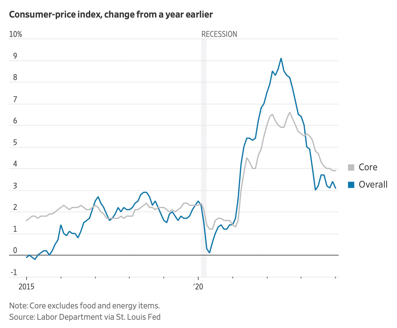
Apparently, according to The Wall Street Journal, the consensus among economists was that year-on-year inflation for January would come in at 2.9%. The CPI actually rose by 3.1%, which is, of course, above those expectations.
But come on! This is hardly hyperinflation.
Okay, so this isn't great. That is still above the 2% target rate, which is where the Fed aims to be. And if you look at the chart below, it does look like inflation has levelled out a bit at 3% and failed to drop down to this target level.
This latest reading is therefore, a huge disappointment for those hoping for an interest rate cut soon.
Generally speaking, I think some of us might be overreacting. When inflation falls, it's often bumpy on the way down. That’s all we’ve seen in recent months. And who said that the Fed is in any rush to cut rates anyway?
The Fed will probably only cut interest rates if there is an imminent risk to the economy, i.e., a possible recession. The consensus now is that the US will have a soft landing. Furthermore, the Fed looks 18 month or more into the future. They are unlikely to get hung up on a single inflation print from the previous month and postpone a rate cut. They want price stability, which is what they have got, albeit at 3% rather than the 2% target.
Source: The Wall Street Journal
So what is behind these inflation numbers
It would be rude of me to just leave it there, without actually discussing what’s behind this latest inflation reading.
The problem lies with the US services sector which has revealed a widespread increase in prices. This has challenged a common belief that inflation issues have been confined to specific areas like delayed adjustments and housing costs, or unique measurement methods in medical services. Or even, changes in car insurance pricing.
Let be serious! January's data actually shows a significant rise in prices across a wide array of service categories, with nearly all of them experiencing month-on-month increases.
Yet, despite these concerning trends, there is a silver lining: core goods prices (excluding food and energy) have shown a decrease both monthly and yearly for the first time since 2020, pointing to deflation in certain areas.
Just take a look at that chart again and you can clearly see this visually. Once again, I think some of us are over reacting.
Coming up:
Europe has never before been this cheap relative to the S&P 500
Bitcoin hit $1 trillion in market cap but so what?
Of course “this time its different” for Nvidia
The rise as the US as the top crude oil producer
If you like what you see here, and you would like to view the other four charts, consider becoming a paid subscriber. It costs less than two cups of coffee for a whole month’s access.
