
Five charts to start your day
Inflation combined with the "long term" is an investor's worst enemy


This is shocking, but not too surprising. One of the first lessons you learn as an investor is the power of compounding. The incremental returns you make on your investments will compound over time and are likely to be the main driver of returns over the long term.
However, what no one mentions are the factors that can compound the wrong way, against your portfolio. A good example is the fees you pay to an asset manager or hedge fund manager. The fees they charge can continuously shave away a piece of your portfolio, regardless of whether they make you money or not.
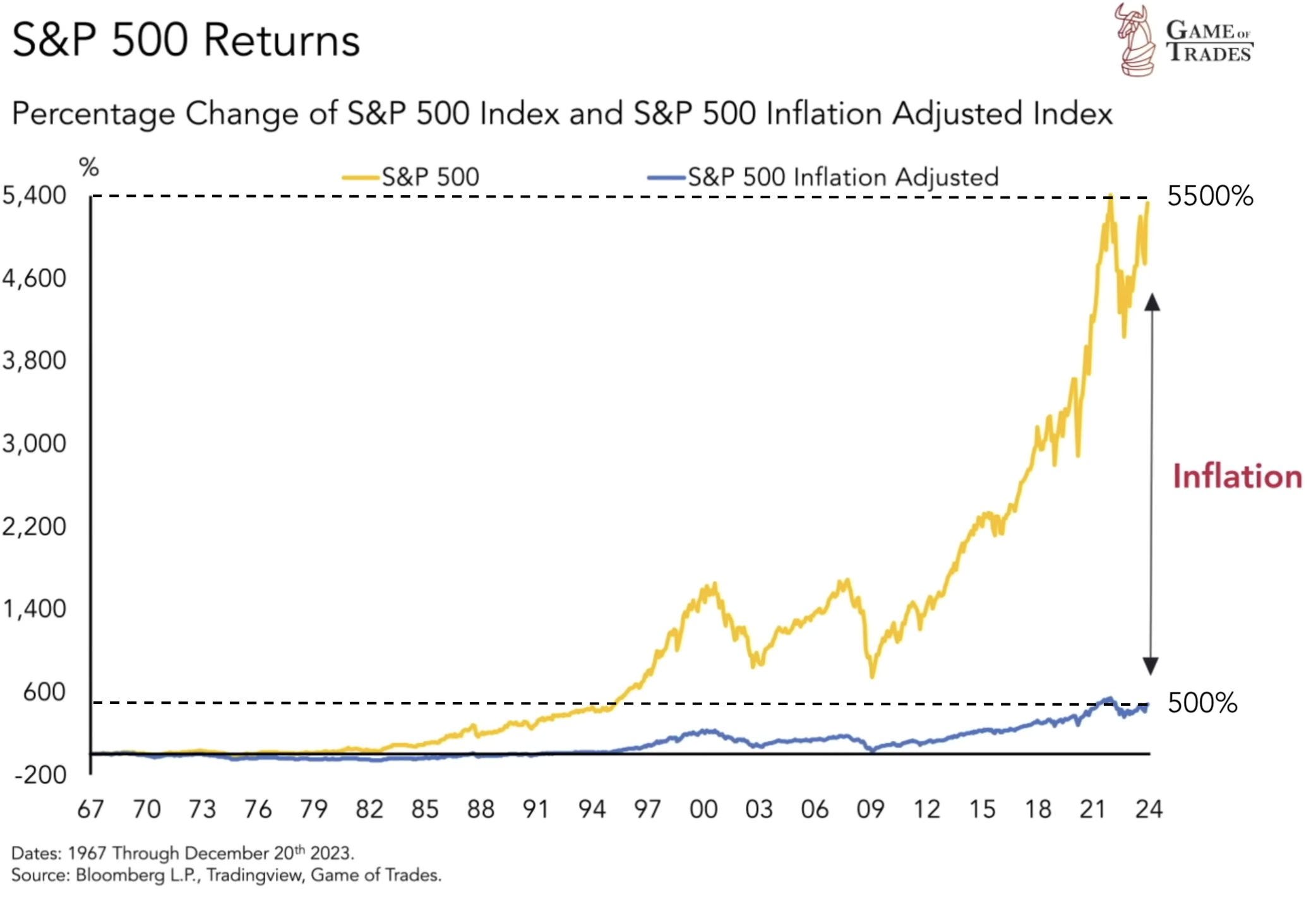
Another example is inflation. It, too, shaves away at your portfolio year in and year out, which is why inflation is an investment risk that needs to be carefully managed. I thought the chart below was brilliant. It really shows this well.
Here you can see the difference in return between the nominal and real return on the S&P 500 index. Moreover, you can clearly see the effects of compounding drastically weakened. Over the long run, the results are quite shocking: if you invested in the S&P 500 in 1967, in nominal terms, you might have achieved a return of 5,500 percent, but in real terms, that return is closer to 500 percent.
Source: Game of Trade
Coming up:
How much longer do you have to live
German companies flock to US with record pledges of capital investment
Fewer US companies are issuing earning guidance that beat estimates
Foreign direct investment into China collapses
If you like what you see here, and you would like to view the other four charts, consider becoming a paid subscriber. It costs less than two cups of coffee for a whole month’s access.
