
Five charts to start your day
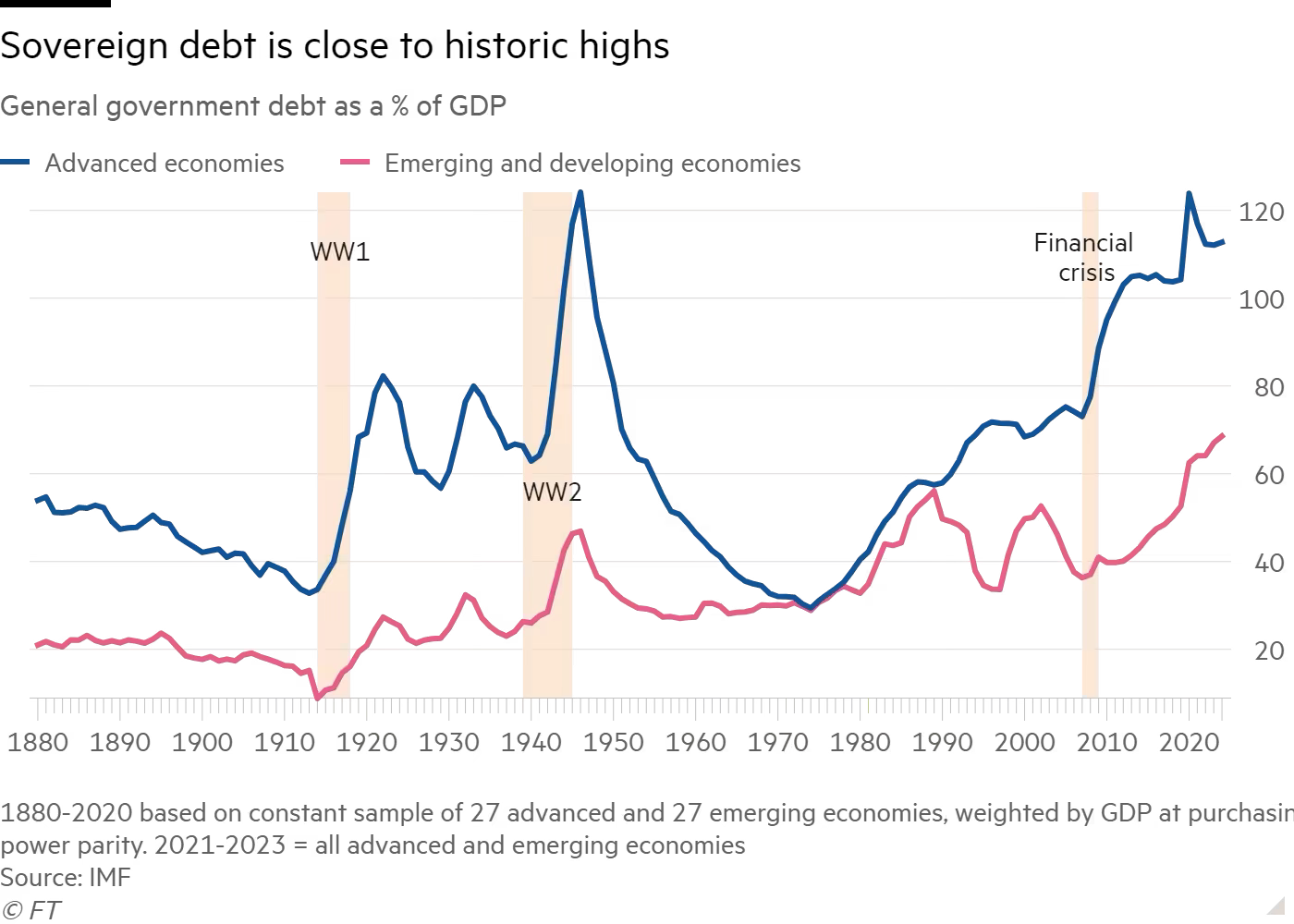
There has been a huge surge in public debt globally leaving many economies vulnerable at a time when interest rates are rising.


This isn’t a surprise. One only needs to look at the US$33 trillion debt pile the United States has amassed to understand the context behind this first chart.
Public debt is at a critical juncture, not just in the US, but globally. High-income countries have seen their debt-to-GDP ratio soar. Emerging economies have also experienced increasing debt levels in recent years.
Olivier Blanchard, former IMF chief economist, asserts that sustaining economic growth is challenging at such high debt levels, particularly in a climate of rising interest rates and sluggish economic growth (in countries outside the US).
To avert a debt crisis, high-income countries might need to implement tighter fiscal policies. This proves to be a challenging task, especially as many countries are grappling with a cost of living crisis. Promoting faster economic growth could help. However, as demonstrated by the UK's Truss government last year, effectively stimulating growth is easier said than done.
This might not yet be a noteworthy story in the US. A robust job market, which has bolstered consumer confidence in the US, has led to a quite favourable third-quarter GDP print – 4.9% year-on-year, the highest in the G7. However, confidence can easily be eroded if there is a government shutdown, the job market weakens, and consumption falls, subsequently causing economic growth to decline.
If you look towards the UK, whose economic growth is flat (0.0% year-on-year), the perils of a high debt-to-GDP ratio become more apparent. The UK government is now in a bind – it has to raise taxes, pay its interest rate bill, but do ll this without economically crushing the electorate.
What is worrying is that the US also has a much larger debt pile, and if it were to one day experience a sovereign debt crisis despite the dollar's dominance, the consequences could be quite dire.
Coming up:
US banks still have huge unrealised losses from their fixed income securities
Rents are rising faster than incomes in the US
The magnificent seven have dominated the S&P 500 this year
Who likes pumpkin pie?
As always the first chart is for sfree, but if you would like to view the other four you can by becoming a monthly subscriber for a very small fee. Opt for a trial if you are interested.
