


For $10 a month, or $100 a year, you support a simple mission: spread great data visualisation wherever it comes from. You help fund the work of finding, sourcing and explaining the charts that deserve a wider audience. And you back a publication built on generosity, transparency and the belief that better understanding makes a better world.
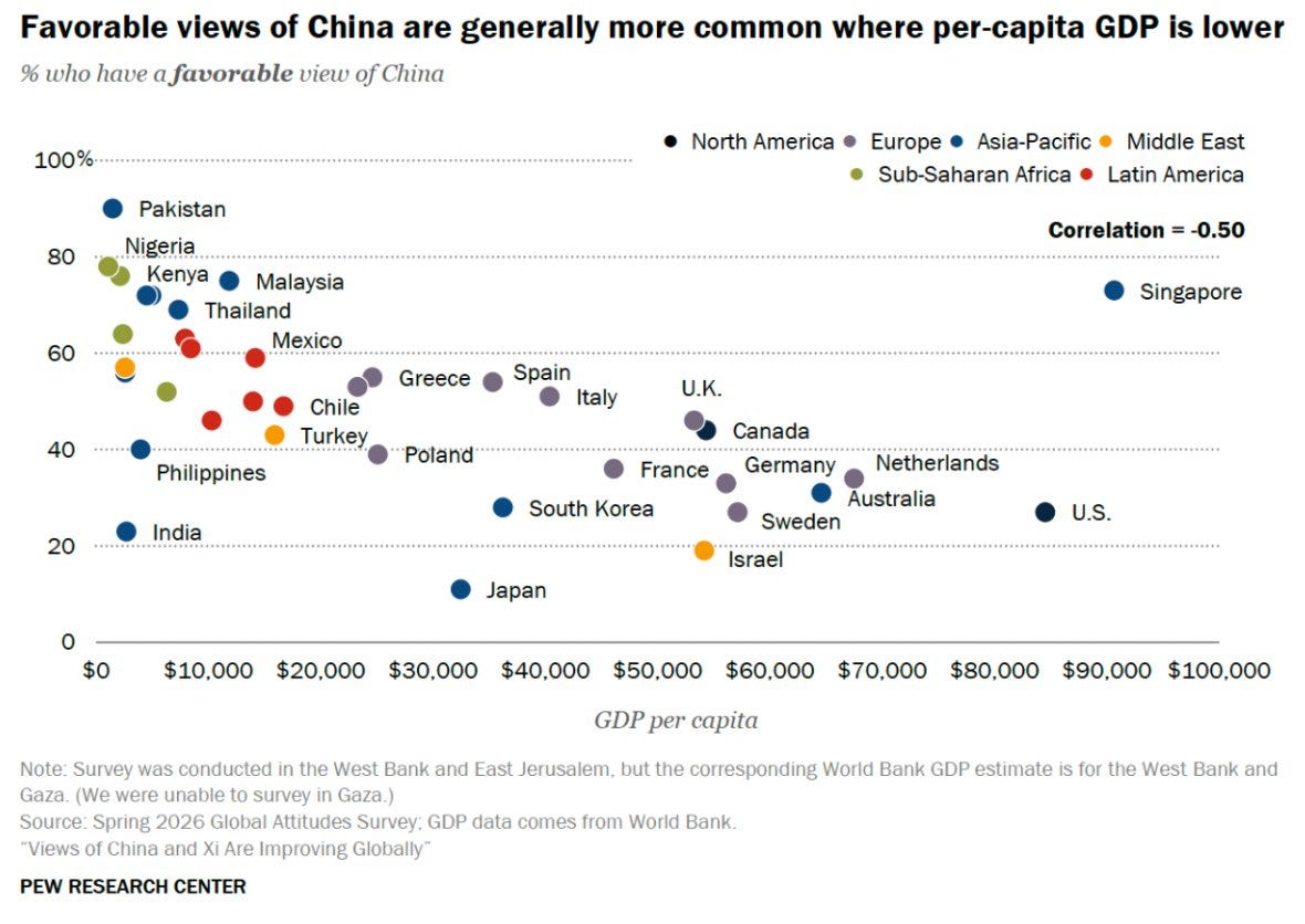
CHART 1 • Poorer countries favour China more positively
If you listen to the current US administration, you could be forgiven for thinking that China is viewed negatively everywhere and that its position in the world is toxic. However, many poorer and middle-income countries judge China less through the lens of US security concerns and more by what it actually offers in trade, infrastructure and finance.
Across the countries surveyed for this data visualisation, favourable views of China tend to fall as income rises. The correlation with GDP per person is -0.50. Pakistan, Nigeria, Kenya, Malaysia and Thailand are among the most positive, while Japan, India, the US and much of northern Europe are far more sceptical.
Income levels do not explain the entire trend, but the pattern makes one thing clear: opinion in richer countries is not the same as global opinion. China can be deeply distrusted by many US allies and still find plenty of room to build goodwill elsewhere.
Source: Pew Research Center
It is easy to be drawn into a particular way of thinking simply because it appears to be the mainstream view. What we believe is often shaped by what we think everyone else believes. This is exactly the risk revealed by first chart. Ironically, these biases can also impact the way that we interpret data and other charts.
Paid subscribers get access to the other four charts: America’s wrong-track polling, American pride by party and age, Amazon’s shareholder base and FIFA World Cup revenue. Together, they show how loyalty and power split across party, age, ownership and commercial incentives.
