
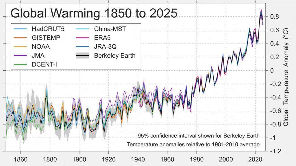
Every major climate dataset tells the same story
Five chart to start your day


For $10 a month, or $100 a year, you support a simple mission: spread great data visualisation wherever it comes from. You help fund the work of finding, sourcing and explaining the charts that deserve a wider audience. And you back a publication built on generosity, transparency and the belief that better understanding makes a better world.CHART 1 • Every major climate dataset tells the same story
The lines in this chart come from different institutions: HadCRUT, NASA GISTEMP, NOAA, Berkeley Earth, ERA5, JMA and others. They use different methodologies, different adjustments and different blends of land and ocean data.
They agree.
From 1850 through the early twentieth century, temperature anomalies oscillate within a relatively narrow band. There is noise, short-term variability, periods of cooling and warming. Then from the late 1970s onwards, the slope changes.
The increase is not a spike. It is persistent and compounding. Each successive decade sits above the previous one. The most recent years cluster at the top of the chart.
What makes the graphic persuasive is not any single line. It is the convergence. Independent datasets, built separately, align closely in both direction and magnitude. The grey band around Berkeley Earth’s estimate narrows in the modern period as data coverage improves.
Anomalies are measured relative to the 1981 to 2010 average. On that basis, recent readings approach or exceed 0.8°C above that baseline. Compared with pre-industrial levels, the increase is larger still.
The debate about whether warming is occurring is over. The question now is how systems adapt to a trajectory that is already locked in.
Source: Paul Krugman
Every major global temperature dataset now points in the same direction. Different methodologies, different institutions, different blends of land and ocean readings. The slope since the late 1970s is unmistakable. The lines rise together. The debate about whether warming is occurring has quietly ended in the numbers.
I have four more charts that expand on these geopolitical and economic cross currents and what they imply for capital, security and energy markets. They are for paid subscribers. Consider joining if you want the full edition and a clearer view of how this transition may unfold.
