
Europe now carries more of Ukraine’s burden
Five charts to start your day


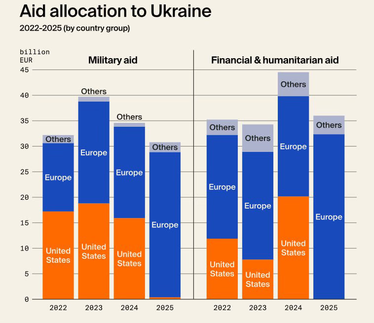
For $10 a month, or $100 a year, you support a simple mission: spread great data visualisation wherever it comes from. You help fund the work of finding, sourcing and explaining the charts that deserve a wider audience. And you back a publication built on generosity, transparency and the belief that better understanding makes a better world.CHART 1 • Europe now carries more of Ukraine’s burden
Since 2022, support for Ukraine has shifted in composition and leadership. This chart breaks down military aid and financial and humanitarian assistance by country group between 2022 and 2025. The balance has changed materially.
In military aid, the United States led in 2022 and 2023, contributing roughly €17bn and €19bn respectively. Europe also played a substantial role, but Washington was central. By 2025, that picture looks different. US military support drops sharply, while European contributions account for nearly all of the total shown.
The shift is even clearer in financial and humanitarian aid. Europe has consistently provided the largest share across all years. In 2024, total non-military assistance peaked at around €45bn, with Europe contributing the majority. By 2025, Europe remains the dominant provider while US allocations appear to have fallen back.
The numbers suggest a structural change rather than a temporary fluctuation. As US domestic politics has become more divided on Ukraine funding, European governments have expanded their role. That carries fiscal implications for EU member states and strategic implications for NATO burden sharing.
The broader question is sustainability. Military support is lumpy and politically sensitive. Financial support requires multi-year commitments.
Source: Olena Halushka
here is no clean separation between economics and security any more. Balance sheets are part of foreign policy. Supply chains are part of deterrence. The slow shifts matter more than the loud speeches.
I have four more charts that extend this geopolitical thread and explore the financial and strategic consequences in greater depth, but they are for paid subscribers. If you want the full edition and the broader context behind it, consider joining.
