
Emerging giants punch above their weight
Five charts to start your day


Switzerland has consistently ranked as the world's most innovative country in major international rankings for over a decade. Whether it's "really" the most innovative depends on how innovation is measured. I can only speak from what I observe living in the country.
The universities here are really well funded and the academics paid very well. This has a huge impact on the quality of research. The country produces more scientific publications per capita than almost any other country, led by world class institutions like ETH Zurich and EPFL. Switzerland also files more patents per capita than any other country, particularly in pharmaceuticals, biotechnology, and precision engineering.
The reason why this is not always noticed is because Switzerland is a very small country. That is why I like this first chart. It’s a lot fairer. If we draw a diagonal line through the chart, representing the trend between GDP per capita and the Global Innovation Index, you can see that several emerging markets did quite well.
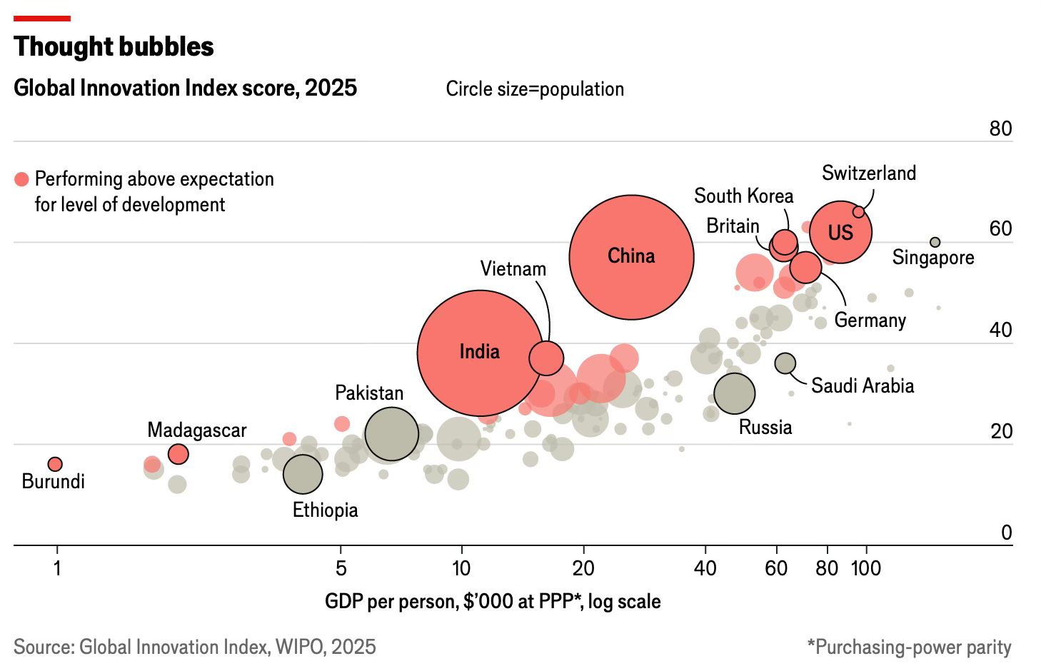
CHART 1 • Global Innovation Index by GDP per capita
What we see is that innovation is not just the preserve of wealthy nations. This chart highlights how several emerging economies are outperforming expectations relative to their level of development. China, India and Vietnam stand out, placing far above where their GDP per person would suggest. Together these countries represent close to three billion people, and their innovation scores are reshaping the global map. They therefore have far more influence collectively than any other country in the world through their sheer size, which Switzerland cannot complete with.
China in particular is a huge outlier. With a GDP per person of around US$25,000 on a purchasing power basis, it still manages to outperform much richer peers, clustering and is almost aligned with Switzerland and the US. India and Vietnam also look impressive, showing that scale and ambition can help close the development gap.
For investors, the message is that innovation is diffusing more widely than before. Technology, R&D and patent activity are no longer confined to the West or a handful of Asian tigers. The next wave of disruptive companies may well emerge from places long dismissed as followers rather than leaders.
Source: Economist
I love bubble charts, but I don't always use them. The reason being is that they are quite difficult to pull off. You need the right data set to apply them properly. For me, the most important criteria is data density.
Bubble charts are very good at showing patterns in very dense clusters of data which is why we use them. You can also record a lot of information in a bubble, from the size of the bubble, which here represents population size, and the position which describes in this case innovation on a relative basis to GDP per capita.
We've got another four more chart to show you, but if you'd like to view them, you will need to become a paid subscriber.
