

For $10 a month, or $100 a year, you support a simple mission: spread great data visualisation wherever it comes from. You help fund the work of finding, sourcing and explaining the charts that deserve a wider audience. And you back a publication built on generosity, transparency and the belief that better understanding makes a better world.
CHART 1 • Eastern Europe is carrying Europe’s defence burden
Europe is spending more on defence, but talking about “Europe” as a single bloc hides an important divide. Poland and the Baltic states are not increasing military spending simply to satisfy NATO targets. They are doing it because the threat from Russia feels immediate and sits close to their borders.
According to SIPRI’s estimates for 2025, Ukraine spent 39.6% of GDP on its military, while Russia spent 7.5%. Ukraine is obviously under severe pressure from Russia, a larger and better resourced invader. But Russia is still outspending much of Europe.
Poland was the third biggest spender at 4.5%, Latvia at 3.6%, Estonia at 3.4% and Lithuania at 3.1%. By comparison in Western Europe, Germany, France, Italy and the UK spent closer to 2.0% to 2.4%.
That doesn’t make western Europe’s spending insignificant, but it reflects a different sense of urgency and a different industrial starting point. Announcing larger budgets is one thing. Turning that money into ammunition, air-defence systems, drones, maintenance crews and trained soldiers is another. Europe’s eastern flank understands that distinction more clearly because it cannot afford not to.
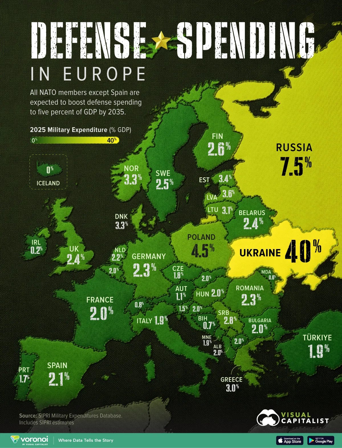
Source: Visual Capitalist
There has been a lot of news about defence spending increasing. However, the real question that needs to be asked is how quickly will this money will deliver improved defence capabilities?
The problem is that a defence pledge is easy to announce. Getting it done properly is hard because it’s always more complex than it seems.
Paid subscribers get access to the other four charts I have here today: Iran’s strikes on US bases, the US Strategic Petroleum Reserve, critical-mineral prices and European hydropower sites for wind and solar. Together, they show why modern security is shaped by geography, stockpiles, supply chains and power connections as much as by headline budgets.
