

For $10 a month, or $100 a year, you support a simple mission: spread great data visualisation wherever it comes from. You help fund the work of finding, sourcing and explaining the charts that deserve a wider audience. And you back a publication built on generosity, transparency and the belief that better understanding makes a better world.
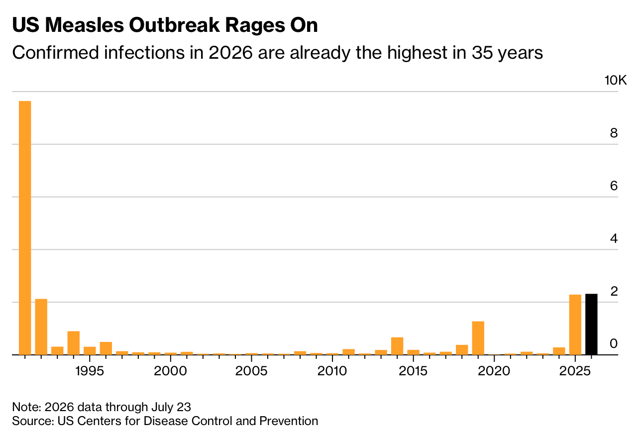
CHART 1 • US measles cases are the highest in 35 years
Measles ought not to be with us today. The reason children are still dying of measles is that vaccination against the disease is not universally applied by parents.
And now we are seeing a surge in infections in the United States. Confirmed US infections for 2026 have already moved above 2,300 cases. This is the highest annual total since the early ’90s. CDC data through to late July put this year above the full 2025 count, with large outbreaks driving this increase.
The problem is that outbreaks cluster where vaccination coverage is too low. This is why measles provides a very powerful warning signal and tells you when a system that once kept a dangerous disease rare has started to lose its coverage.
Source: Bloomberg
Something I forgot to mention is the cost imposed on a healthcare system when vaccination coverage is allowed to fall. The immediate tragedy is that children can die from preventable diseases such as measles. But the consequences extend much further. Outbreaks require hospital treatment, testing, contact tracing, isolation and emergency vaccination campaigns. They consume money and staff time that could have been used to treat other patients.
Immunisation can therefore produce a substantial return on investment. Preventing disease avoids medical costs, protects people’s ability to work and reduces the pressure placed on hospitals and public-health services.
Paid subscribers get access to the other four charts: daily smoking across OECD countries, Gen Alpha’s dream jobs, US tariff receipts and the UK millionaire count. Together, they show how behaviour, aspiration and tax politics become clearer when the claim is checked against the number.
