

For $10 a month, or $100 a year, you support a simple mission: spread great data visualisation wherever it comes from. You help fund the work of finding, sourcing and explaining the charts that deserve a wider audience. And you back a publication built on generosity, transparency and the belief that better understanding makes a better world.
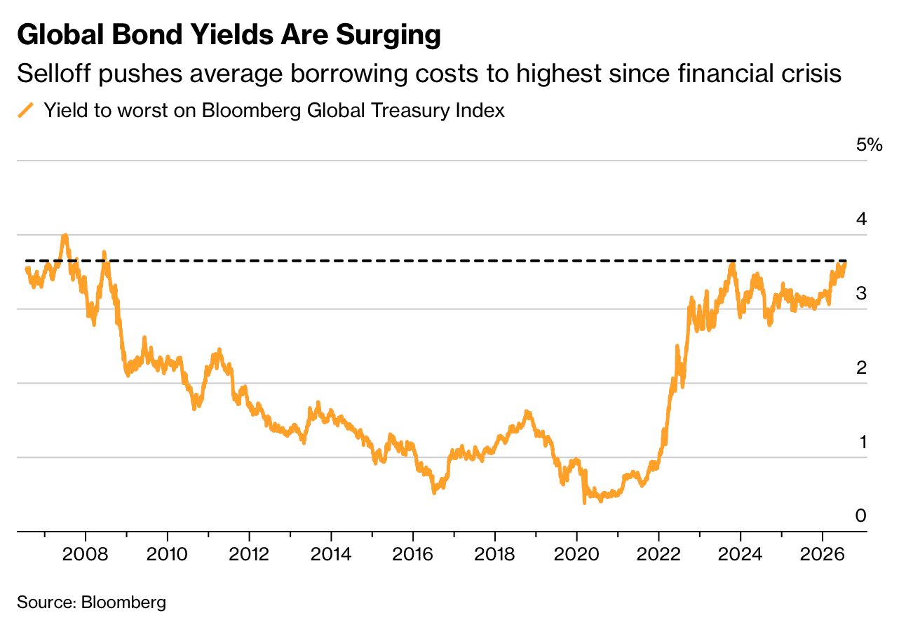
CHART 1 • Global government bond yields near crisis-era highs
Global government bond yields are rising. Governments that have issued those bonds, therefore, will need to pay more interest to borrowers if they wish to borrow more or roll over existing debt. As older and cheaper debt expires and is replaced, the national interest bills of those countries gradually increases.
The Bloomberg Global Treasury Index yield-to-worst is back near the highest level since the financial crisis. Recent pressure has come from a mix of oil-driven inflation worries, heavy government borrowing and a much larger need for private capital.
This index is an average, so it hides substantial differences between countries. Even so, the broader message is difficult to ignore: the era of exceptionally cheap government borrowing has ended.
As cost of finance rises, new borrowing will becoming harder to justify because interest payments consume a larger share of government budgets, leaving less money for public services and investment. This could in turn impact economic growth over the longer term.
Source: Bloomberg
I know bond yields often confuse people and can seem abstract and boring. But this is an exceptional story, and it must be told. If government borrowing costs continues to increase, then the burden will be felt on the economy because governments will have less to spend (beyond interest payments). What’s remarkable is how much that cost of borrowing has risen since the pandemic. We are now at levels not experienced since the financial crisis, 18 years ago.
Paid subscribers get access to the other four charts: technology stocks in the S&P 500, the US share of major-economy equities, household stock exposure and sovereign wealth funds. Together, they show how global wealth is becoming more exposed to US markets, pension design and state-owned capital.
