
Do Americans die earlier?
Five Killer Charts


In case you missed it, I published last week. In short, America’s healthcare bill is sky‑high yet its citizens die younger. The average American pays $12,555 per head, which means the US spends 2.5× the OECD average on healthcare. This matters because that level of spending represents 17.6 % of US GDP. This level of spending is crowding out wages, dividends and fiscal fire‑power.
CHART 1 • US life expectancy lags wealthy peers
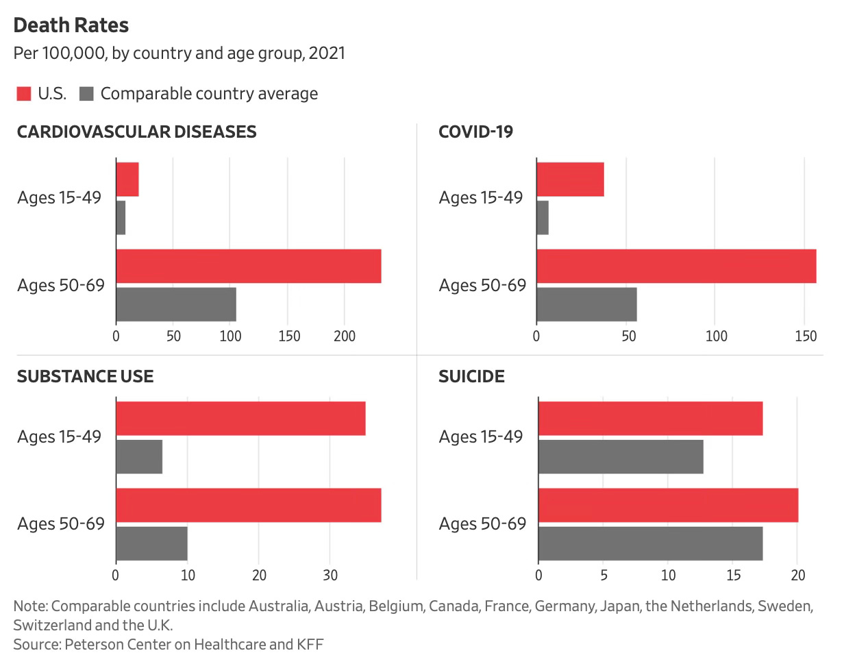
America once led medical innovation, yet its citizens now die younger than those in every other rich nation. The decline stems from chronic illnesses, opioid abuse, and Covid-19's disproportionate toll on an already unhealthy population.
Rising obesity and patchy primary care undermine progress made against heart disease and cancer. The chart tracks life expectancy since 1980, with the US curve flattening whilst peers keep climbing.
Snap stat – US life expectancy trails the rich-country average by approximately 6 years.
Quick take – Chronic disease and addiction erase decades of health gains.
Why it matters – Poor worker health drags productivity and inflates healthcare costs.
Steal-this-caption – "Americans now live about six years less than their rich-world peers." #HealthcareReality
Source: The Wall Street Journal
Want the other four? Become a paid subscriber.
