
Debt climbs while growth slows
Five chart to start your day


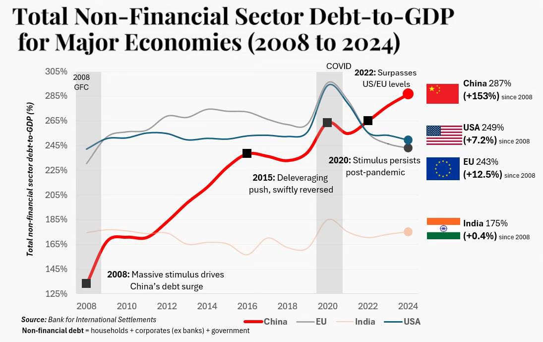
The story we were told after 2008 was simple. The crisis would force a long period of repair. Households, companies and governments would pay down debt and rebuild their balance sheets. Today’s chart shows how far reality has drifted from that script.
Global growth has slowed, yet debt keeps climbing. China is the clearest example. Its non financial debt has more than doubled as a share of GDP since the financial crisis, rising from around 125% to about 287%. The United States and Europe have edged higher too. Only India looks broadly unchanged. The world has leaned ever harder on credit at the very moment productivity growth has faded.
That leaves policymakers in a bind. Economies are more sensitive to interest rates, yet they rely on cheap borrowing to sustain demand and investment. Raising rates bites harder. Cutting them risks feeding another cycle of leverage. There is less room for error and fewer easy exits.
Today’s chart is a snapshot of that dilemma. The data tells the story.
For $10 a month, or $100 a year, you support a simple mission: spread great data visualisation wherever it comes from. You help fund the work of finding, sourcing and explaining the charts that deserve a wider audience. And you back a publication built on generosity, transparency and the belief that better understanding makes a better world.CHART 1 • Debt climbs while growth slows
This chart shows how global debt has kept climbing even as growth has slowed, something easy to miss in the noise of daily headlines. The world entered the last decade expecting the 2008 crisis to trigger a long era of deleveraging. Instead the opposite happened. Most major economies now carry far more non financial debt relative to GDP than they did at the start of the century and that shift is reshaping policy and competitiveness.
China is the standout. Its non financial debt to GDP ratio has risen from around 125% in 2008 to about 287% today. The surge began with the huge stimulus package launched during the financial crisis, then accelerated after 2015 when an attempt to rein in credit was quickly abandoned. Covid support pushed the figure higher still and by 2022 China overtook both the US and the EU. The US and the EU have also inched up over time, while India is the outlier with almost no change, reflecting a slower credit cycle and a very different growth model.
The result is a world more sensitive to interest rate moves yet reliant on continued borrowing to support demand and investment. Heavy debt and weaker productivity leave policymakers with far less room for error.
Source: Reddit
What worries me most about this picture is not the level of debt on its own. It is the combination of heavy borrowing and weak productivity. We are bringing future growth forward while doing less to improve the engine that has to repay it. That is a fragile way to run a global economy.
Debt in itself is neither good nor bad. It is a tool for shifting resources across time. Used well it builds new capacity. Used badly it simply props up the present. The chart today suggests we are moving closer to that second path in several major economies.
In the full edition I have four more charts that explore how this backdrop is showing up in markets, jobs and technology. They are for paid subscribers. If you want the complete daily version of Five Killer Charts, and to support this work, consider becoming a paid subscriber.
