
Countries where people live the longest
Five Killer Charts

Good morning – here are your five chart for the day. Each one comes snap stat, quick take and why it matters. Skim, steal, forward (but always credit!!).
CHART 1 • Life expectancy reveals the global health divide
Where you're born largely determines how long you'll live. Monaco tops the world with 87 years, whilst Nigeria sits at the bottom with just 55 years. This staggering 32-year gap reflects vast differences in healthcare, wealth, and living conditions.
There are systemic inequalities. African countries face the double burden of high infant mortality and inadequate care for the elderly, lacking the medical infrastructure that wealthy nations take for granted.
However, be careful about the conclusion you draw. Low life expectancy in a country often reflects high infant deaths rather than adults dying young. Someone who survives childhood in a "low life expectancy" country may well reach their 70s.
Snap stat – Monaco leads global life expectancy at 87 years, whilst Nigeria trails at 55 years
Quick take – Geography is destiny when it comes to lifespan, with wealth driving the biggest gaps
Why it matters – A 32-year lifespan gap between rich and poor countries shows health inequality is getting worse, not better
Steal-this-caption – "Where you're born determines how long you live" #GlobalHealth
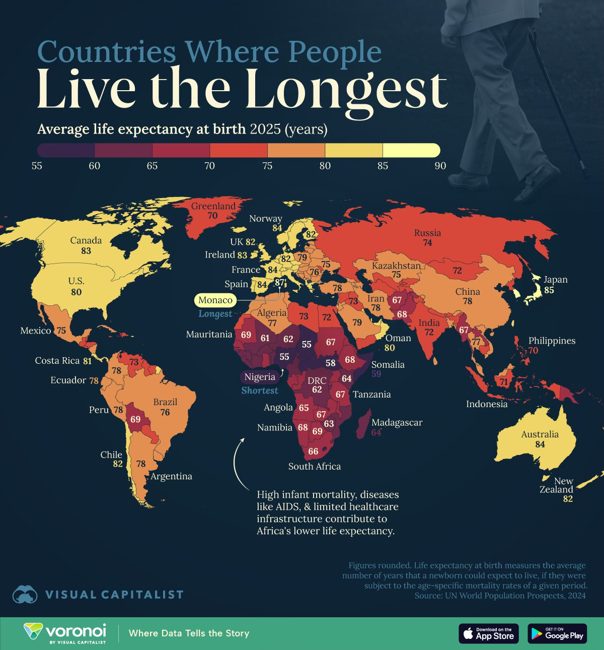
Source: Visual Capitalist
Want the other four? Become a paid subscriber.
