


For $10 a month, or $100 a year, you support a simple mission: spread great data visualisation wherever it comes from. You help fund the work of finding, sourcing and explaining the charts that deserve a wider audience. And you back a publication built on generosity, transparency and the belief that better understanding makes a better world.
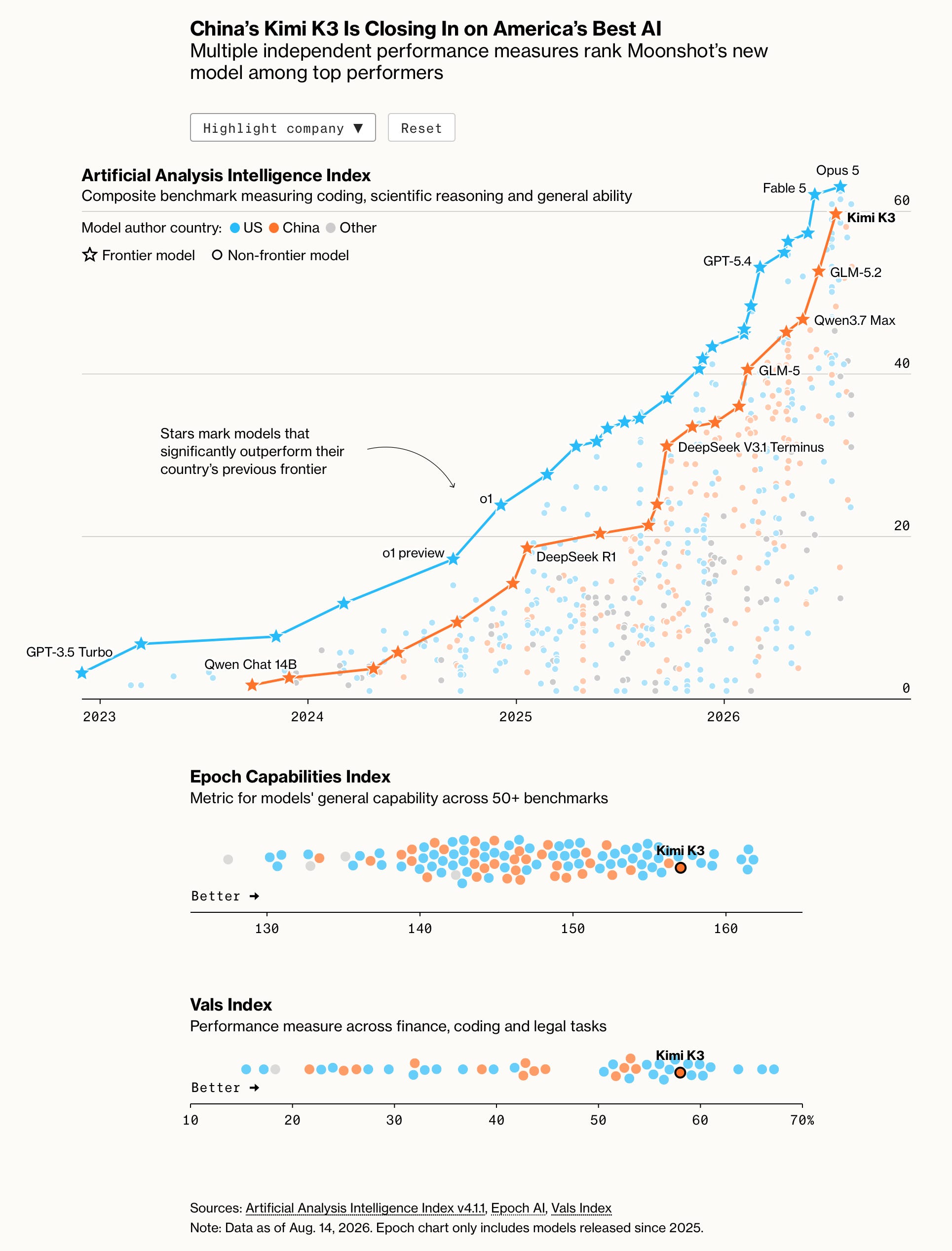
CHART 1 • China’s models have joined AI’s frontier
I’m a little bit sceptical about this chart because I’ve used pretty much every frontier AI model out there, and I still think China’s frontier models, like Kimmi K3, and the latest frontier models, like Opus 5, are vastly different in terms of capability. Anthropic and OpenAI have accelerated phenomenally over the summer, and although Chinese models are still very impressive, they are just not yet on the same level as the frontier models from major US AI companies. So although this chart seems to suggest that the gap is closing, it really doesn’t feel like it if you use these models day to day for many different tasks, including software engineering.
However, one area that China really shines at is cost, which is really where it takes the lead. You can use Chinese models relatively cheaply versus extremely expensive frontier US AI models. I think this is where the key difference lies. China can deliver AI models that offer value for money and decent quality at the same time.
With aggressive pricing, China could offer a far more irresistible AI offering for developers and businesses in the future, and this is already happening. US companies like Airbnb, food delivery giant DoorDash and crypto exchange Coinbase Global have all adopted Chinese models hosted on local servers.
Source: Bloomberg
Paid subscribers get access to the other four charts: developer use of Chinese models, consumer AI downloads, cheaper model economics and Claude’s paid conversion. Together, they show how capability, distribution, price and revenue can produce different winners.
