

For $10 a month, or $100 a year, you support a simple mission: spread great data visualisation wherever it comes from. You help fund the work of finding, sourcing and explaining the charts that deserve a wider audience. And you back a publication built on generosity, transparency and the belief that better understanding makes a better world.
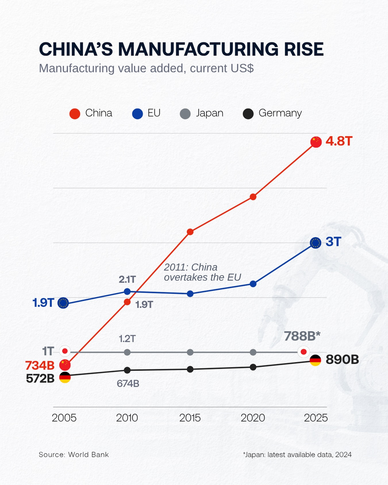
CHART 1 • China’s manufacturing lead continues
This is an interesting chart, but also an unsurprising one. The rise of China over the last two decades has been phenomenal, and this chart shows just how dramatic that rise has been. China manufactures almost 50% more value added than the EU.
This divergence shouldn’t be shocking, as I’ve already mentioned. It’s consistent with the decades of investment that China has made in infrastructure, its increasing production capacity and the way it has created dense industrial clusters that reinforce its ability to manufacture efficiently and at speed. Plus, it doesn’t just export what it manufactures; it also serves its own huge domestic market.
Source: World Visualized
The line that really sticks out is Germany. Germany has traditionally been the workshop of Europe and, as you can see, it is trailing behind and has almost flatlined for the last two decades in comparison with China’s meteoric rise.
Will China slow down? Only time will tell. So far, it hasn’t happened, despite the trade war with the United States and the punitive tariffs placed on China by both the US and the EU. China has just shifted markets and is now serving the wider Asia-Pacific region with its manufactured goods.
Paid subscribers get access to the other four charts: HSBC’s hiring map, Costco’s overheads, the tariff vote and India’s weight-loss drugs. Together, they show how global scale is reinforced, or limited, by decisions made inside companies and households.
