
China’s export machine enters a new technological phase
Five charts to start your day

For $10 a month, or $100 a year, you support a simple mission: spread great data visualisation wherever it comes from. You help fund the work of finding, sourcing and explaining the charts that deserve a wider audience. And you back a publication built on generosity, transparency and the belief that better understanding makes a better world.CHART 1 • China’s export machine enters a new technological phase
At the start of the century China’s rise as an export powerhouse was driven largely by labour intensive manufacturing. After joining the World Trade Organization in 2001 the country rapidly expanded production of textiles, basic electronics and other goods that relied on low cost labour, driving a sharp rise in its trade surplus.
That first phase of globalisation eventually slowed as wages increased and political tensions began to reshape supply chains. Yet the chart suggests China’s export momentum did not fade. Instead it shifted towards more technologically advanced industries.
In recent years the strongest growth has come from sectors such as electrical equipment, electronics and transport technology. Exports in these areas have surged, pushing China’s trade surplus to new highs, particularly after 2020 as global demand for technology and industrial equipment accelerated.
Some economists now describe this as a second China shock. The challenge is no longer low cost manufacturing alone, but China’s growing presence in higher value industrial sectors.
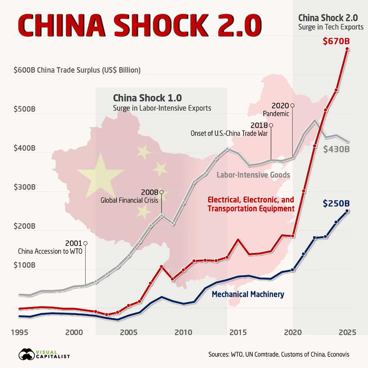
Source: Visual Capitalist
One of the themes running through these charts is concentration. Production, technology and energy systems are clustering around a handful of countries and industries. That creates extraordinary efficiency, but it also introduces fragility.
Periods of technological acceleration often bring new forms of competition and unexpected vulnerabilities.
I have included four additional charts in the full edition that expand on this story and explore where these pressures might emerge next. They are available for paid subscribers, so consider joining if you would like the complete analysis each week.
