


For $10 a month, or $100 a year, you support a simple mission: spread great data visualisation wherever it comes from. You help fund the work of finding, sourcing and explaining the charts that deserve a wider audience. And you back a publication built on generosity, transparency and the belief that better understanding makes a better world.
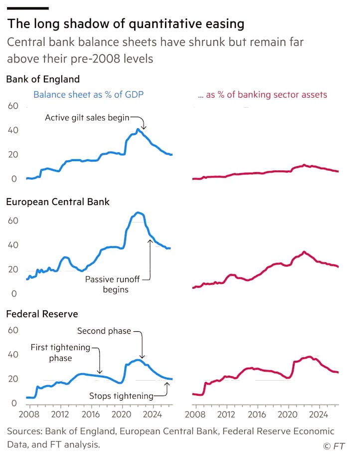
CHART 1 • Central banks cannot fully rewind QE
In the wake of the great financial crisis in 2008, central banks saw their balance sheets soar under quantitative easing. That continued all the way until the end of the pandemic, as the balance sheets of the Bank of England, the European Central Bank and the US Federal Reserve reached a share of between 40 and 60 per cent of their respective countries’ GDP.
The US Federal Reserve was the first to start normalising its balance sheet, in 2017. This first attempt ended in 2019, only for the repo market to blow up the next month and reveal that it had gone too far. The second attempt was more orderly and avoided another repocalypse when it ended QT late last year.
The Bank of England was more aggressive in its approach. It shrank its balance sheet by allowing its bonds to mature and through outright gilt sales. As a percentage of GDP, its balance sheet has fallen by just over half from its 2022 peak. However, the big problem the UK now faces is rising borrowing costs.
Source: Financial Times
The ECB was the last to end quantitative easing and has been the slowest to unwind. Its caution reflects the challenges it faces in maintaining financial stability across the 21 countries that share the euro.
It’s fair to say that the era of large-scale asset purchases might be over. But large central bank balance sheets are probably here to stay. They still remain highly elevated from where they were before the great financial crisis more than 20 years ago.
Paid subscribers get access to the other four charts: foreign demand for US stocks, Russia’s 14% policy rate, Donald Trump’s second-term fortune and collapsing diamond prices. Together, they show how policy, power and technology rewrite financial value.
