
Britain’s migration mix changed after 2020
Five charts to start your day

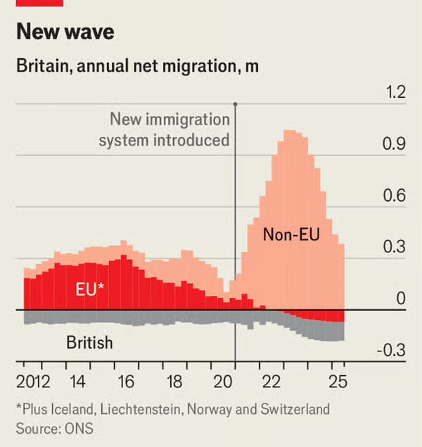
For $10 a month, or $100 a year, you support a simple mission: spread great data visualisation wherever it comes from. You help fund the work of finding, sourcing and explaining the charts that deserve a wider audience. And you back a publication built on generosity, transparency and the belief that better understanding makes a better world.CHART 1 • Britain’s migration mix changed after 2020
Hospitals, care homes, food processors and logistics firms all faced the same problem after the pandemic. Vacancies stayed high even as economic growth slowed and wage pressures rose.
Before 2020, net migration was largely shaped by EU inflows and movement within the UK. After the new immigration system came into force, that pattern flipped. EU migration faded steadily while non EU arrivals increased sharply. Total net migration rose, but the more important shift was the composition of who was coming and why.
Public debate often focuses on headline numbers. What it misses is that different migration routes feed different sectors, have different skill profiles and respond to different pay and visa constraints. Policy changed the structure of labour supply, not just its size.
Which sectors are now most exposed to a migration system that prioritises some skills and countries over others?
Source: Economist
What I find striking is how often debates lag the structure they are meant to explain. We argue about totals and averages while the important changes happen inside the breakdown. By the time the consequences feel obvious, the adjustment has already taken place.
I have four more charts to share with you today, but they are for paid subscribers. If you want the full edition and the deeper thread behind it, consider joining.
