
BlackRock shows how scale compounds over time
Five charts to start your day


For $10 a month, or $100 a year, you support a simple mission: spread great data visualisation wherever it comes from. You help fund the work of finding, sourcing and explaining the charts that deserve a wider audience. And you back a publication built on generosity, transparency and the belief that better understanding makes a better world.CHART 1 • BlackRock shows how scale compounds over time
BlackRock’s growth is not the result of clever trades or short term bets. It is the outcome of structural compounding.
Assets under management have risen from hundreds of billions to more than $14 trillion, driven by market growth, steady inflows and the long shift towards passive investing. Each market cycle adds to the base rather than resetting it.
Scale reinforces itself. Distribution lowers costs. Lower costs attract flows. Flows increase influence. Over time, the firm becomes part of the infrastructure of global capital rather than a simple asset manager.
This concentration has consequences. Market structure, voting power and liquidity are shaped by firms of this size simply through participation. The question is not whether scale matters, but how much is too much.
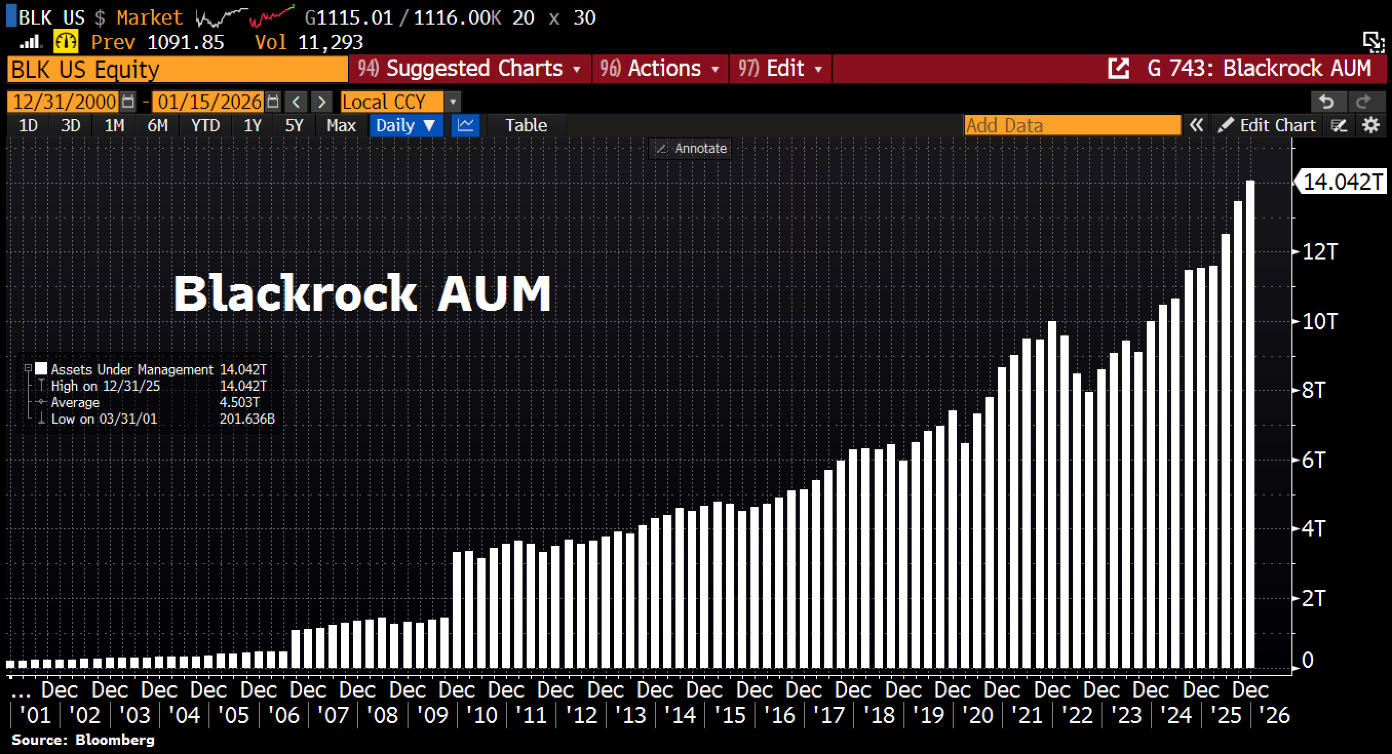
Source: Holger Zschaepitz
What unsettles me is how easily scale hides risk in plain sight. Large systems feel safer because they are familiar and liquid. But that same size can make them brittle when conditions shift. Rotation, currency moves and valuation resets tend to arrive quietly, then accelerate.
These charts are not predictions. They are signals. They show where gravity is building and where flexibility is being lost. In markets, that distinction matters more than narratives.
I have four more charts that extend this idea and look at where scale is creating hidden pressure points. They are for paid subscribers. Consider joining if you want the full edition and a sharper view of how power, size and capital are reshaping markets.
