


For $10 a month, or $100 a year, you support a simple mission: spread great data visualisation wherever it comes from. You help fund the work of finding, sourcing and explaining the charts that deserve a wider audience. And you back a publication built on generosity, transparency and the belief that better understanding makes a better world.
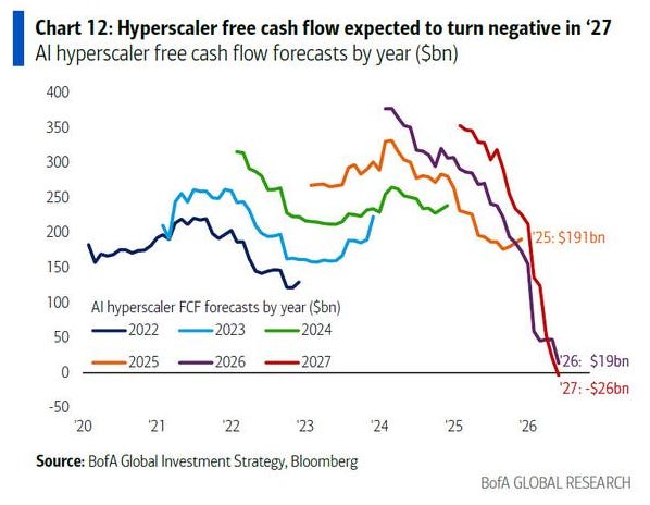
CHART 1 • Big Tech’s AI free cash flow is turning negative
Free cash flow is what remains after a company has covered its operating costs and capital spending. The reason I like it is because it cuts through much of the AI hype surrounding the technology companies covered by the media.
Even when demand is strong, a company can still burn through too much cash. For an AI company, this can result from spending on servers, chips, data centres, cooling systems and power. It must attract enough paying customers to cover those costs.
Take a look at this chart. Forecast free cash flow for Amazon, Alphabet, Meta, Microsoft and Oracle falls from $191 billion in 2025 to $19 billion in 2026, before recovering slightly to $26 billion in 2027. On the other side are suppliers such as Nvidia, Broadcom, Applied Materials, Micron and other chip-related companies, which are paid while the infrastructure is being built.
The decline is striking. Chipmakers collect revenue as capacity is added, but cloud companies must later prove that this capacity can generate sufficient returns after depreciation, power and other operating costs.
Source: Barchart
What I would watch out for now having look at this first chart, is the difference between the price demanded for AI and the cost of building it. It seems simple enough to compare, but it isn't. Neither metric is completely clear because cost today is often incurred to meet the demand in the future, which we don't fully comprehend yet. This is the risk investors face, yet for some reason many investors have assumed it with certainty.
Paid subscribers get access to the other four charts: falling AI model prices, US data-centre concentration, young software-developer employment and selective software stock performance. Together, they show why the AI boom is now turning into a question about pricing, land, power, jobs and stock-market confidence.
