

For $10 a month, or $100 a year, you support a simple mission: spread great data visualisation wherever it comes from. You help fund the work of finding, sourcing and explaining the charts that deserve a wider audience. And you back a publication built on generosity, transparency and the belief that better understanding makes a better world.
CHART 1 • Beef is the primary driver of deforestation
This is quite a shocking chart from Our World in Data. Beef production has been the biggest driver of deforestation this century. The data says it all. Around 128 million hectares of forest have been cleared to make space for agriculture and forest plantations. To put this into perspective, that’s an area five times the size of the United Kingdom. Most of this has occurred in Brazil and other parts of Latin America, where forests are cleared to make way for grazing pastures.
Oilseeds such as soy and palm oil were the second-largest driver. The majority is concentrated in Latin America when it comes to soy, and in Indonesia and Malaysia for palm oil. However, it’s worth noting that while deforestation for palm oil was high in the early 2000s and 2010s, it has since fallen quite considerably.
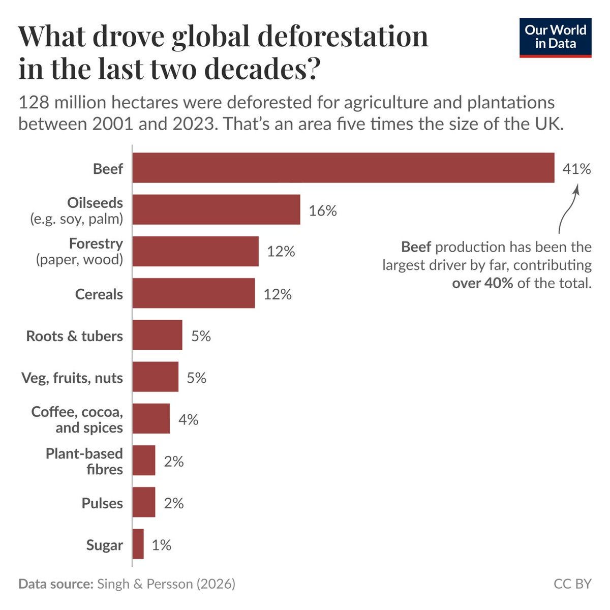
Source: Our world in data
Forest plantations are another driver of deforestation. These are manicured plantations used to grow certain cash crops, such as cocoa and coffee. This type of deforestation has been concentrated in Africa, where yields have not grown quickly enough to offset rising demand.
Paid subscribers get access to the other four charts: threatened oil inventories, Bordeaux’s rainfall reversal, rising memory prices and mobile-game spending risks. Together, they show why the mechanism behind a headline matters as much as the headline itself.
