
Beef is no longer cheap protein
Five charts to start your day


For $10 a month, or $100 a year, you support a simple mission: spread great data visualisation wherever it comes from. You help fund the work of finding, sourcing and explaining the charts that deserve a wider audience. And you back a publication built on generosity, transparency and the belief that better understanding makes a better world.CHART 1 • Beef is no longer cheap protein
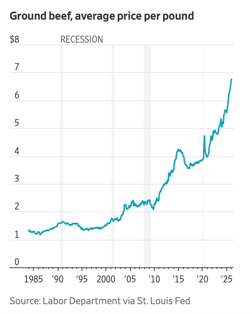
In the mid-1980s, a pound of ground beef cost just over $1. For nearly two decades, prices moved gradually. There were bumps around recessions, but the line drifted rather than surged.
Then something shifted.
Take a look at this chart. From the early 2000s onward, the slope steepens. Prices push above $2, then $3, then $4. The 2014 spike looks dramatic, but what follows is not a return to trend. It is a new, higher baseline that Americans now have to live with today. As at 2025, the average price per pound as approached $6.50.
Part of this reflects input costs: feed prices, energy, labour and transport all rose sharply after 2020. Drought conditions reduced herd sizes. Cattle inventories in the US have fallen to multi-decade lows. When supply tightens and rebuilding takes time, prices persist.
But what is most interesting about this is that ground beef is not a luxury good. It is a staple. When staple protein prices double over a generation and then accelerate again within a few years, households feel it immediately.
Source: Wall Street Journal
What concerns me most is how normal these pressures are beginning to feel. When staples double in price over a generation and housing absorbs nearly half a salary, the adjustment becomes cultural. Expectations shift downward. Planning horizons shrink.
At the same time, entrenched systems, whether in retail scale or sports leagues, continue to concentrate value. The gap between those with structural advantage and those exposed to daily cost pressures quietly widens.
I have four more charts that explore this divide in greater depth and what it could mean for consumer resilience and asset prices. They are in the paid edition. Consider joining if you want the full analysis and the complete set of charts.
