Banks are back and America is leading the charge
Five charts to start your day
The ghosts of 2008 still haunt the glass towers of global finance. Those of us who lived through it remember the queues outside Northern Rock, the collapse of Lehman Brothers, and the surreal morning when governments worldwide became the largest shareholders in their banking systems. Walking through the doors of HSBC then watching colleagues clear their desks, I saw decades of careers vanish in an afternoon.
Sixteen years on things appear to be changing. American banking has reinvented itself as a profit powerhouse once more, while somehow maintaining the capital buffers regulators demanded. The question nobody quite wants to ask is whether we're watching a genuine resurrection or merely another act in the endless cycle of boom and bust.
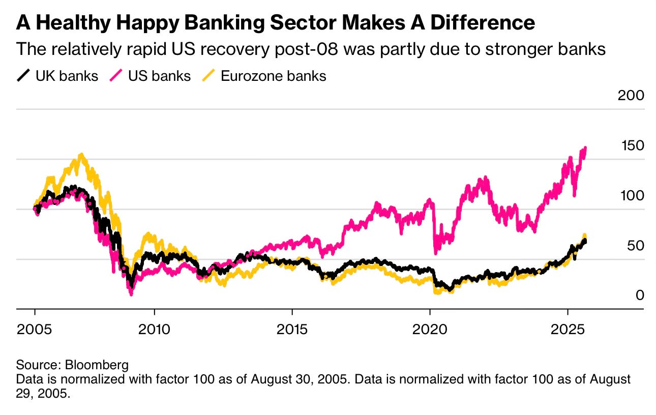
CHART 1 • Banks are back and America is leading the charge
US banks have roared back to life, delivering their strongest performance in decades. The sector posted collective net profits of $268.2 billion in 2024, up 5.6% from the previous year, while maintaining rock-solid capital ratios that would have been unthinkable during the 2008 crisis.
What's particularly striking about this recovery is how dramatically it diverges from the European experience. While US bank stocks have surged nearly 50% above their pre-2008 levels, their European counterparts remain stuck at half their previous valuations.
But here's the uncomfortable truth: this divergence might say more about different market conditions than banking fundamentals. US banks have surfed a spectacular equity bull market that's pushed the S&P 500 up 400% since 2009, while European markets have struggled with anaemic GDP growth of just 0.7% in 2024.
European stress tests actually appear more stringent – the 2025 EU-wide test assumes a brutal 6.3% GDP contraction over three years, far harsher than US scenarios. Perhaps European valuations reflect reality whilst US banks ride a wave of exuberance fuelled by looser capital requirements and booming asset prices. JPMorgan might generate more profit than all German banks combined, but that could simply mean European banks are priced correctly whilst Wall Street is drunk on its own success. Harsh, but it is a question worth asking.
Source: Bloomberg
It's funny how a simple chart can generate so many thoughts and ideas. But I've literally lived through this entire history. In fact, the chart starts when I start my career back in 2005. So yes! This chart was quite thought provoking for me.
I wonder if you felt the same way. I have four more charts to share with you but you will need to become a paid subscriber to see them.
Join me!


