

For $10 a month, or $100 a year, you support a simple mission: spread great data visualisation wherever it comes from. You help fund the work of finding, sourcing and explaining the charts that deserve a wider audience. And you back a publication built on generosity, transparency and the belief that better understanding makes a better world.
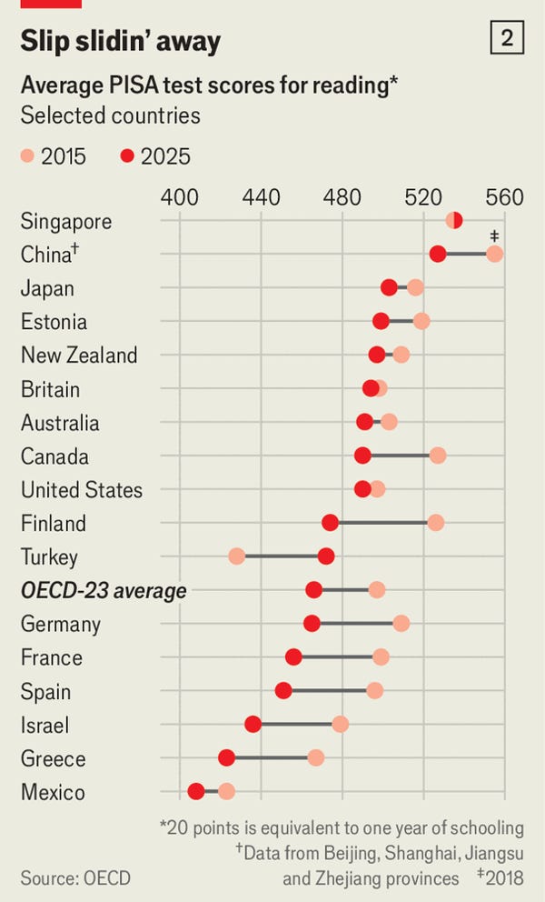
CHART 1 • Are students getting dumber?
This chart will resonate with any worried parent. It’s obvious. Of course children’s reading abilities have deteriorated. It’s all those devices and social media.
But there are a few things we need to be careful about here. What are PISA reading scores? How are they measured? Who takes these tests, and how representative are they?
What this test does is assess a 15-year-old’s ability to understand written information, interpret it, and then evaluate its meaning. This goes beyond just recognising words or reading a passage of text. They need to be able to explain what they read, follow an argument, and then judge whether the information they are reading is correct.
Source: The Economist
That makes these results concerning. Are our kids reading less, or are they reading differently? They might encounter plenty of words through messages and social media posts, but that does not necessarily give them the same practice in following a sustained argument or understanding complex prose.
So I would take this chart seriously. But evidence that reading performance has declined is not the same as evidence explaining why. As George Bush once asked, “Rarely is the question asked: Is our children learning?”
Paid subscribers get access to the other four charts: international tuition fees, the graduate hiring squeeze, Europe’s source-checking divide and obesity rates. Together, they show how skills, costs and habits shape opportunity long after formal education begins.
