


For $10 a month, or $100 a year, you support a simple mission: spread great data visualisation wherever it comes from. You help fund the work of finding, sourcing and explaining the charts that deserve a wider audience. And you back a publication built on generosity, transparency and the belief that better understanding makes a better world.
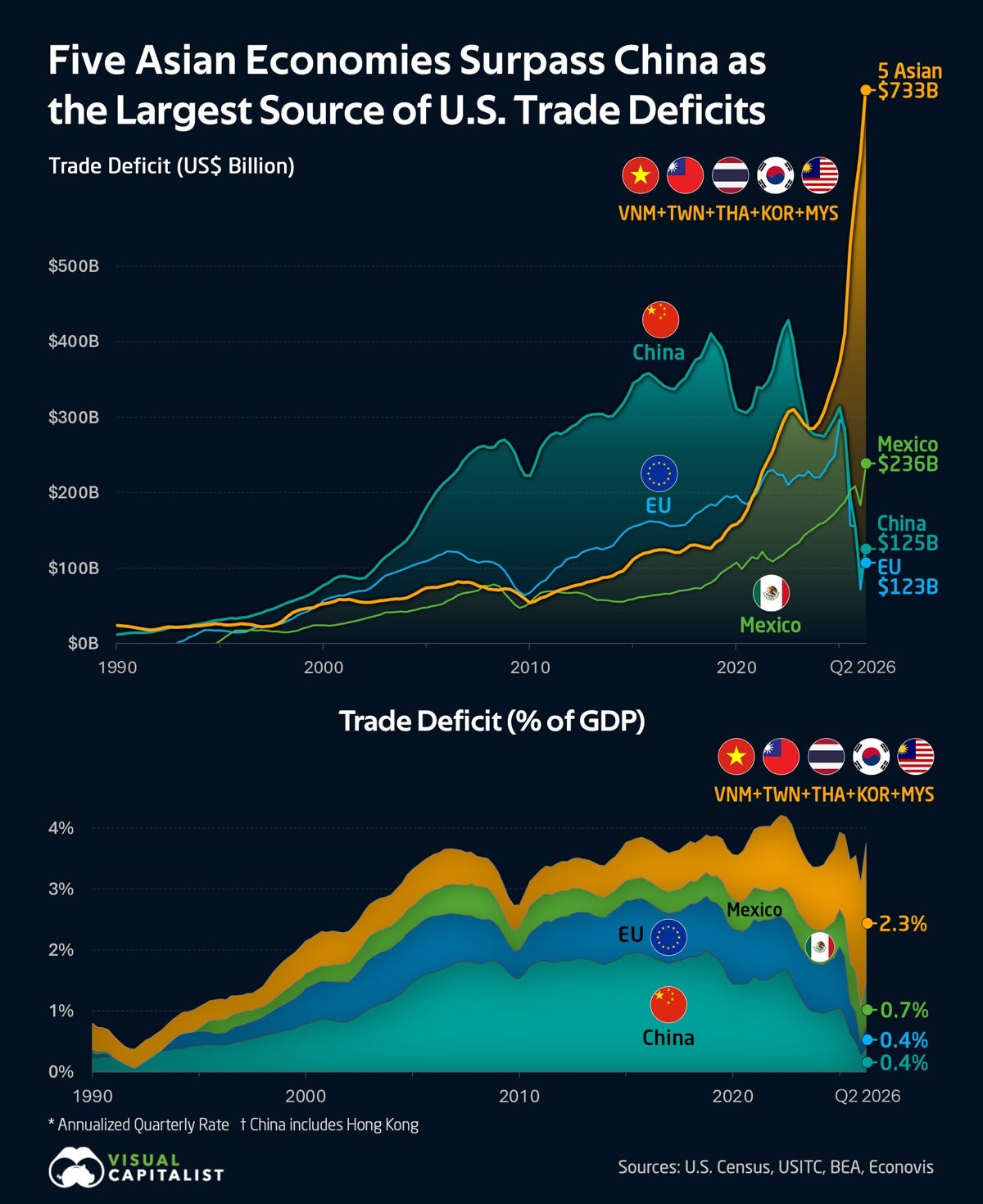
CHART 1 • America’s stealth trade deficit with China
There’s quite an interesting story going on here with this chart. As you can see, China had a huge trade surplus in goods with the US until the Trump administration slapped on punitive tariffs to restore the balance. This chart shows that this strategy might have backfired, because the rest of Southeast Asia has seen a huge increase in its goods trade surplus with the US.
The US may no longer be importing as much directly from China, but China has a huge trade network already spread across Southeast Asia. It can still produce vast quantities of goods and redirect that trade through its South Asia trade network to reach the US.
This may seem hugely inefficient, but when you consider how high the tariffs are on Chinese goods, it seems to make a lot of sense to redirect trade that way. In fact, it saves money for US companies trying to import cheap manufactured goods and reduce the cost that tariffs place on them and their customers.
Source: Visual Capitalist
Paid subscribers get access to the other four charts: Asian AI stocks, China’s data-centre capacity, Nike’s margins and blockbuster albums. Together, they show how scale, scarcity and distribution decide who captures value.
