


For $10 a month, or $100 a year, you support a simple mission: spread great data visualisation wherever it comes from. You help fund the work of finding, sourcing and explaining the charts that deserve a wider audience. And you back a publication built on generosity, transparency and the belief that better understanding makes a better world.
CHART 1 • America’s labour force is no longer an engine of growth
A really interesting selection of charts here from Bloomberg. Over the past 65 years, the US’s potential workforce grew by about 1.4% annually. However, net migration has now plunged, while baby-boomer retirement has reduced participation in the workforce among older adults. The US Federal Reserve has estimated that labour-force growth may be close to zero in 2026.
The other charts are also pretty revealing. The share of adults working or looking for work fell to 61.4% in July. Employers cut 23,000 roles. May and June’s previously reported gains were reduced by 103,000. Yet, on the bright side, unemployment fell to 4.1%. The US may need fewer than 10,000 new jobs per month to keep that rate steady, down from 155,000 in 2023 and 2024.
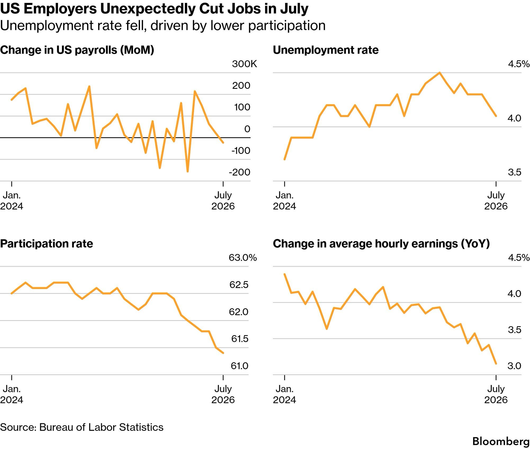
Source: Bloomberg
Low unemployment can therefore coexist with a weaker economy. With almost no additional labour, any increase in what the US produces must now come from each worker producing more. That makes the productivity promise from AI, and the cost of failing to deliver it, much higher.
Paid subscribers get access to the other four charts: UK permanent hiring, academic freedom, Ebola detection and urban homicide. Together, they show how institutional capacity erodes through many small failures before the consequences become obvious.
