


For $10 a month, or $100 a year, you support a simple mission: spread great data visualisation wherever it comes from. You help fund the work of finding, sourcing and explaining the charts that deserve a wider audience. And you back a publication built on generosity, transparency and the belief that better understanding makes a better world.
CHART 1 • America’s 1970s inflation nightmare is back in view
America has not returned to the 1970s, but it has rediscovered one of that decade’s nastier lessons: inflation can appear beaten before it is beaten. The Washington Post chart below, lines up the 1970s surge with the 2020s and the resemblance is awkward enough to matter.
The mechanism is not mysterious. Energy prices feed transport, food, expectations and politics. The 1978-79 Iranian revolution did not create America’s inflation problem from scratch, but it helped turn a retreat into a second ascent.
The US economy is less unionised and the Federal Reserve has more credibility. Still, a war-related oil shock landing on top of tariffs and sticky services prices is not a detail. It is exactly the sort of complication that turns a soft-landing story into something less comfortable.
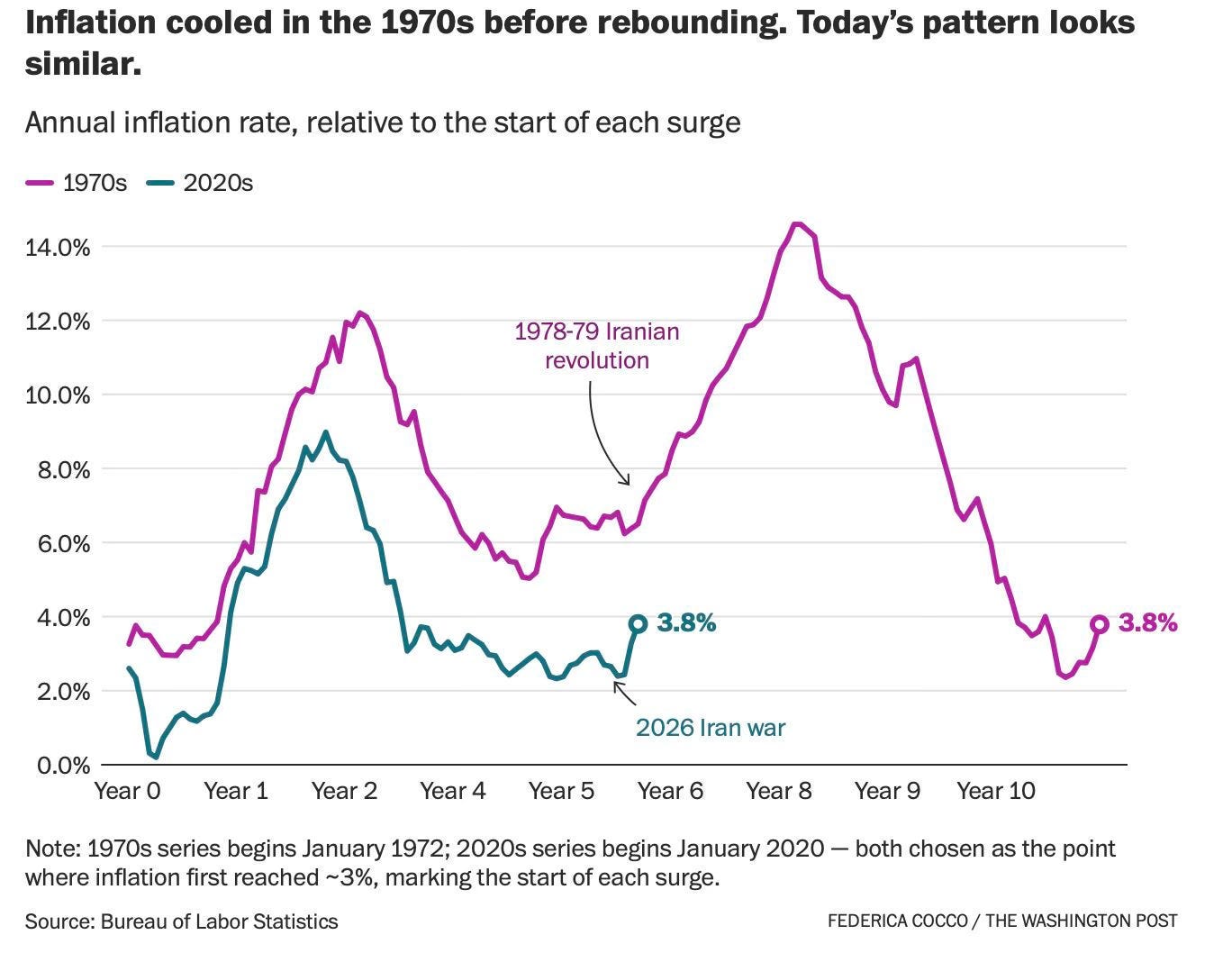
Source: Federica Cocco, The Washington Post
Inflation becomes dangerous when it migrates from statistics into behaviour. People change how they borrow, bargain, vote and invest once they stop trusting the promise that price rises are temporary.
I’ve got four more charts that follow the pressure through bonds, margin debt, credit cards and household balance sheets. They show where the stress is already visible, and where the public story may still be too calm.
