


For $10 a month, or $100 a year, you support a simple mission: spread great data visualisation wherever it comes from. You help fund the work of finding, sourcing and explaining the charts that deserve a wider audience. And you back a publication built on generosity, transparency and the belief that better understanding makes a better world.
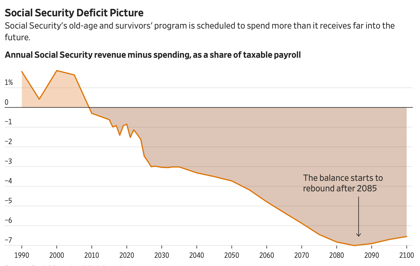
CHART 1 • Americans face Social Security crisis
Social Security’s retirement fund has been in annual deficit since around 2010, and its projected balance never recovers through 2100. Millions of Americans depend on those payments, so unless Congress changes the programme, workers will pay more or retirees will receive less.
This is largely a pay-as-you-go system: payroll taxes from today’s workers finance today’s benefits. Lower birth rates mean fewer future workers supporting each beneficiary, while longer retirements and scheduled benefits push spending above taxable payroll. Past surpluses built reserves that temporarily covered the difference, but they did not remove it.
Those reserves are expected to run out late in 2032. Current payroll taxes would then cover about 78% of scheduled benefits, leaving an abrupt cut of roughly one-fifth if politicians do nothing.
Source: The Wall Street Journal
I think the uninterrupted negative line is more revealing than that deadline. By the 2080s, the annual gap exceeds 7% of taxable payroll and remains close to that level at the end of the century.
A projection running to 2100 cannot be precise. Birth rates, wages and life expectancy will all change. But uncertainty does not produce a painless escape. Every year of delay leaves less time to phase in higher contributions or lower benefits, increasing the chance that one generation absorbs a sudden adjustment.
Paid subscribers get access to the other four charts: international pension gaps, retirement costs abroad, bonds’ lost portfolio cushion and Japan’s rising yields. Together, they show how governments, geography and markets divide the burden of financing later life.
