
Ageing is reshaping the global economy
Five chart to start your day


For $10 a month, or $100 a year, you support a simple mission: spread great data visualisation wherever it comes from. You help fund the work of finding, sourcing and explaining the charts that deserve a wider audience. And you back a publication built on generosity, transparency and the belief that better understanding makes a better world.CHART 1 • Ageing is reshaping the global economy
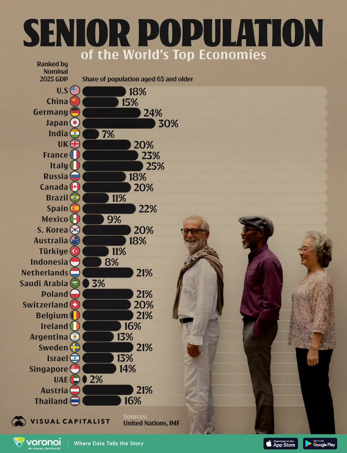
Demographics move slowly until they suddenly matter. This chart shows the share of people aged 65 and over across the world’s largest economies. Japan leads at 30%. Italy stands at 25%. Germany is at 24%. By contrast, India is at 7% and Saudi Arabia just 3%.
The gap is structural. Across much of Europe and East Asia, low birth rates and rising life expectancy have steadily increased the proportion of older citizens for decades. Japan’s 30% reflects long running population decline and limited immigration. Italy and Germany face similar pressures. In these economies, a shrinking working age population must support a growing number of retirees.
The contrast with younger economies is stark. India, Indonesia and Mexico still have relatively small senior populations. That creates a different set of challenges and opportunities, from labour supply to pension sustainability. The United States sits in the middle at 18%, younger than most of Europe but ageing steadily as the baby boom generation retires.
Ageing changes everything quietly. It affects tax bases, healthcare spending, housing demand and long term growth potential. Countries with older populations may see slower trend growth and higher fiscal pressure. Younger economies may enjoy a demographic dividend, but only if jobs and productivity keep pace.
Source: Visual Capitalist
A few percentage points more retirees each year. A slightly higher share of revenue from payments rather than software. A steady climb in vehicle output from a company few outside China knew a decade ago.
None of it feels dramatic on its own. Together, it redraws the map of growth.
I have four more charts that extend this structural story and explore where the next imbalances may emerge, but they are for paid subscribers. If you want the full edition and the deeper context behind it, consider joining.
